Creating a pixel-perfect conversion from Figma to WebFlow

I have been creating pixel-perfect conversions from Figma for a while now. However, I have been noticing that there is a lot of demand for conversions into WebFlow.
In this article, I will utilize a FEM challenge to test out WebFlow from the perspective of a Web developer. How different is it from traditional hand-coded HTML and CSS work? Am I going to run into any unexpected gotchas or unexpected peculiarities?
What is a "FEM Challenge"? |
Frontend Mentor (FEM for short) is a platform that provides some tricky challenges which test your ability to recreate designs from a provided Figma design. They are tricky to reproduce, especially if you want to do a "pixel-perfect conversion". I love doing these challenges as they help you improve your "CSS intuition". They are also great for comparing the workflow between different platforms. |
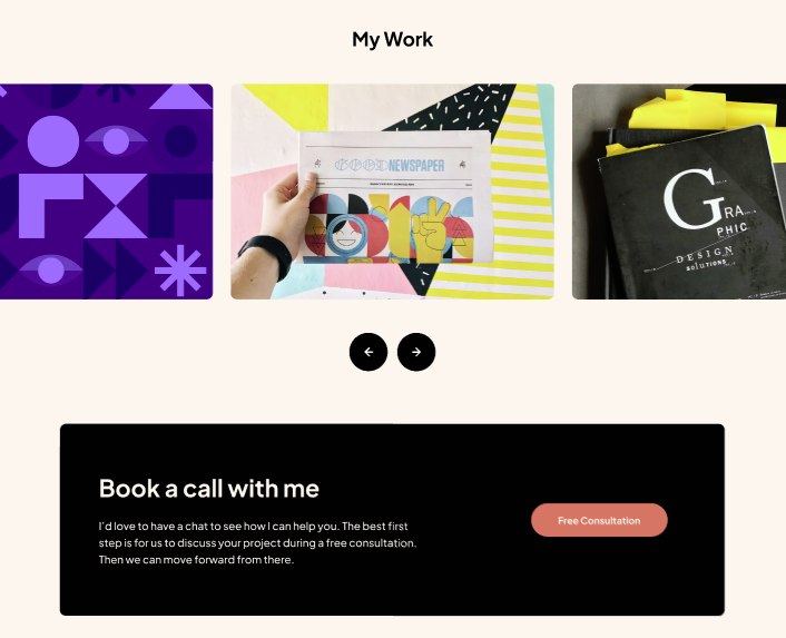
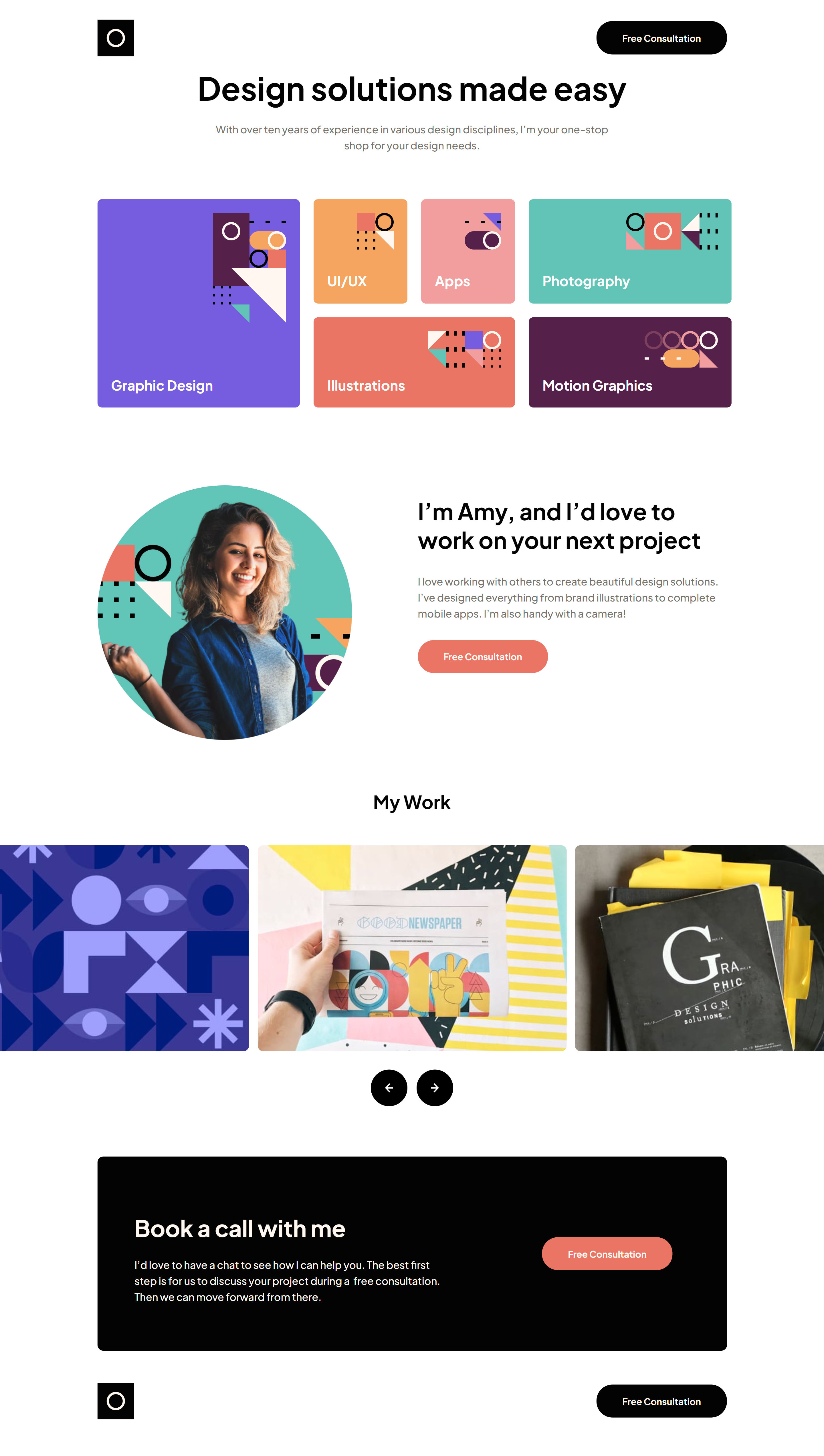
In this article, my goal will be to force myself to learn and understand the native WebFlow process as much as possible, which means avoiding going into the custom CSS unless I have to. To start with I chose the "Single Page Designer Portfolio" challenge from FEM, and this is the design we'll be recreating inside this article.
Goal:
We need to recreate the design just using native WebFlow settings, features and options. We're only allowed to resort to the custom CSS or JS options when something cannot be achieved from the main WebFlow UI.
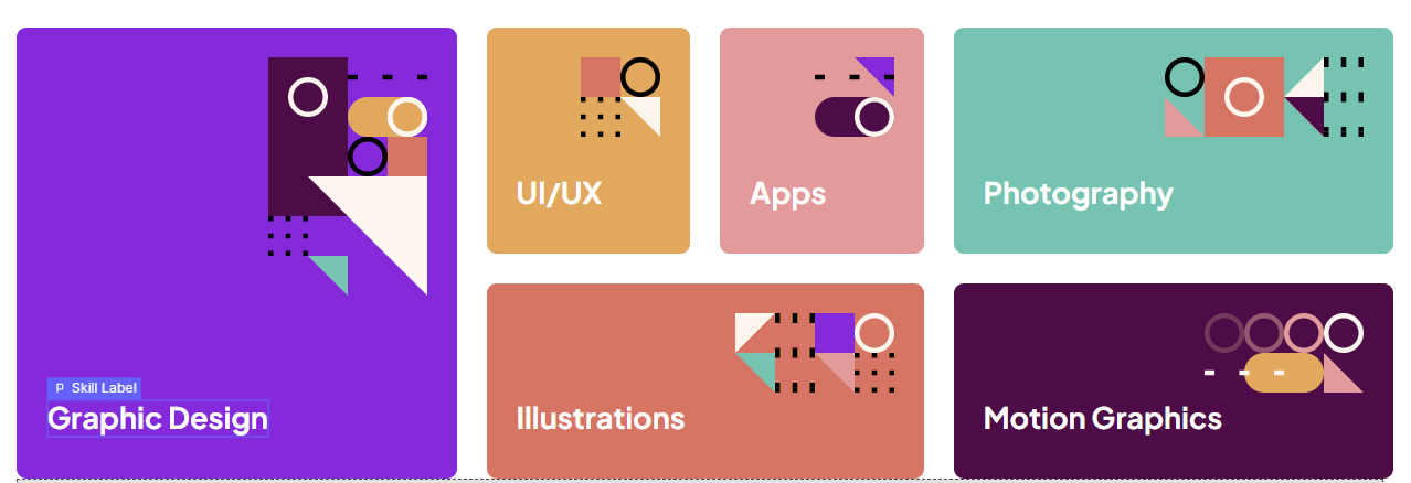
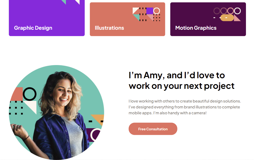
The design challenge that we're given

This is the design we need to recreate. I've already finished this challenge before in raw HTML and CSS. My challenge here (again) is seeing what it will take to achieve the same using WebFlow.
Let's talk about pixel-perfect vs responsiveness
The Figma file we receive from Frontend Mentor has a desktop layout set at a width of 1440px. It also includes a "tablet" (768px) layout and a "mobile" layout (480px).
In case you're not familiar with how FEM works: |
After you submit your final hosted website it auto-generates screenshots, and puts them in a visual comparison tool. With this, you can easily see how closely your design matches the reference design. |
If you build your site to match the Figma pixel-for-pixel at the defined screen sizes, the comparison will show your site to be almost identical to the reference design. But is this "truly responsive"?
I've heard people say "Responsiveness is more important than being pixel-perfect". While that statement is true on its face, it also happens to be a false dichotomy. You're not required to choose one or the other.
My goal is typically to match the Figma perfectly at the 3 given screen sizes, and then use CSS best practices to make sure it scales logically on screens that are in between those 3 breakpoints (if necessary).
In addition, if I find that the design doesn't look good on larger screens, I might add extra breakpoints, like 1600px or 1920px.
Let's go ahead and look at the breakpoints in WebFlow
It seems WebFlow is less flexible than other solutions, and it doesn't give you the option to customize the breakpoints.
The way that WebFlow works is that it provides a so-called "base breakpoint", a tablet breakpoint and two mobile breakpoints.
All the styling that you define on the base breakpoint cascades down, so the workflow assumes that you build your base design on this breakpoint, then tweak it for tablet and mobile later on.
Fortunately, the tablet and mobile match the screen sizes given in FEM challenges.
If you hover over the breakpoints, you will notice something like this:
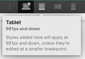
The tablet mode affects all screens 991px and down. Why it's not 992px and down, I do not know. But the mobile matches FEM as well with mobile being "767px and down".
Now here's a "gotcha" about how WebFlow works. You can't change the size of what they call the "base breakpoint". It means "all base styles that all other breakpoints inherit" and isn't limited to any one given screen size. Think of it like all the CSS you write at the root level of a CSS file, and not inside a media query.
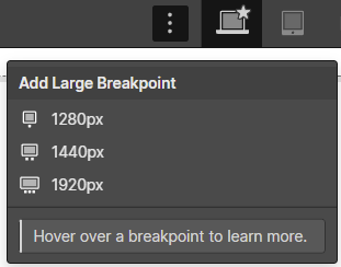
The gotcha here is that if you're doing a FEM challenge you might be tempted to add the 1440px "additional breakpoint, like so:
And then, you might be tempted to build the entire site while you have this breakpoint chosen.
However, an additional breakpoint like this one is only meant for things you want "overridden" on a larger screen. You shouldn't be defining your base styling in it.
Personally, when I am doing FEM challenges, if I need to define additional breakpoints I typically will go for 1600 and 1920. However, there is no 1600 breakpoint in Webflow.
In this guide, I will only finalize the main 1440px design |
So with all of this in mind, in this conversion project, we will be building out the 1440px screen from the FEM-provided Figma file. We will do so while we have the "base breakpoint" selected. Documenting all the tablet and mobile adjustments would just make this guide excessive and include a ton of unnecessary repetition. |
If you're a web developer that does responsive designs, the information in this guide should be sufficient to help you easily know what to do to finish the mobile and tablet breakpoints.
It's just a process where you select "mobile" or "tablet" in the breakpoint selector and enter different values for all the properties that differ from desktop.
Getting started, setting up the structure
If you create websites using raw HTML and CSS, the very first step in your workflow is probably to set up your overall structure. Ideally using semantic markup.
We can follow the same workflow in WebFlow; We'll just add the sections and elements that represent the base structure of the page and its markup.
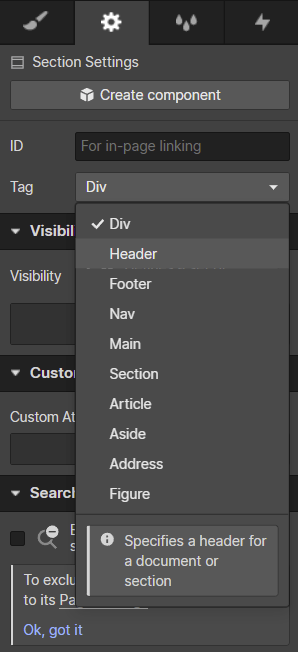
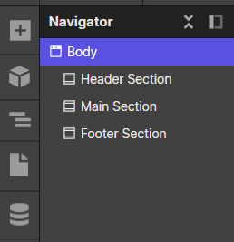
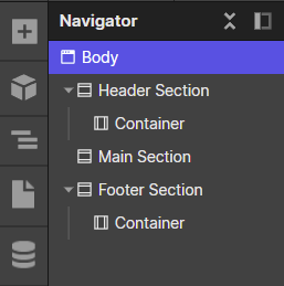
To do this, I went ahead and added a WebFlow "section" element for each of the main parts of the website. Namely the header, the main and the footer.
Note that in WebFlow there isn't a separate "footer" element or a "header" element. You utilize a so-called "section" element and choose the semantic tag from the section settings, like so:
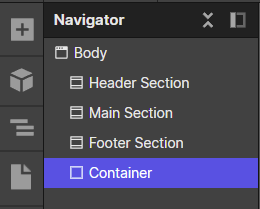
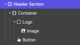
After doing this, you will see this weird situation in the Navigator:
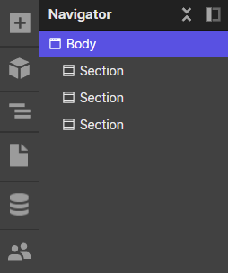
How are you supposed to tell them apart? They all say section despite one being a header, the other main, and the third being a footer. In Oxygen Builder you can just name sections whatever you want for organizational purposes.
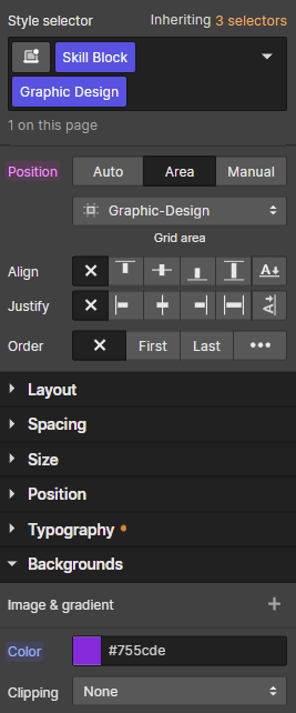
In WebFlow however you can't choose a name. It will instead show the name of the first class that you've assigned to the section. So the only way to organize your structure is to give classes to these sections. Let's do that now.
You select the section, the in the panel on the right and under "Style selector" you type the name of the class you want to assign and click enter:
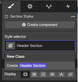
You might have noticed that this naming doesn't fit naming in traditional CSS. This is because WebFlow classes are kind of an abstraction on top of CSS classes. So you can name them whatever you want, and they can contain a space.
With that out of the way, if we give each of the sections a class, we get something a bit more organized, like so:
I'll be honest, this felt a bit awkward to do. Creating a class just so your navigator isn't confusing kind of feels weird. Unfortunately, it doesn't seem like WebFlow gives you a choice.
But wait, it gets even weirder due to "combo classes" and "containers".
If you're coming from the CSS world you might think that going to the style selector and typing "Another class" will work the same as in CSS. Your intuition would be that it's the same as doing classes="class another-class" in CSS.
Due to the way WebFlow works, when you add more classes, they don't act as they do in CSS, at least not by default. This is because only the first class that you add is a "Base Class". And base classes do act as you would expect them to.
You can assign the same base class to multiple elements, and it's just like assigning the same CSS class to multiple elements in HTML. They will be styled the same way, provided that they all have this one base class assigned.
However, if you add any additional classes to an element, beyond that one first "base class", things get a little bit weird. Subsequent classes are either "combo classes" or "global combo classes".
This is a problem if you want to apply the "container" pattern from regular CSS
Let's take a common pattern in regular HTML&CSS workflows - adding a container class on all the sections you want to constrain.
In this classic pattern, you would define a class (typically called .container), setting a certain max-width. You would then simply assign this class to all elements that you want to have said constraint.
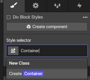
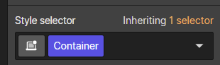
However, if you try to apply this pattern in WebFlow, you're going to be surprised. What do I mean by this? Let's say that you go to one of the sections we created and decide to append another class called "Container".
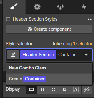
You might think you're appending and creating a new global class called "Container", and that you can then just assign it to the other 3 sections and they're all going to be styled in the same way. That's not what happens.
Notice that it says you're creating a new "combo class". This is a special WebFlow abstraction. Let's take a step back to see what that means.
Understanding combo classes in WebFlow
When you append a "combo class" to your base class, it creates a new "combined class".
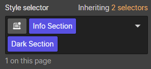
Let's say that you have a section with a base class of "Info Section".
You then type in "Dark Section" in the field and hit enter
This then acts as a new "combined class" called "Info Section Dark Section".
It inherits all the styles from the "Info Section", but can override them.
You can now go to the background-color property and set it to a darker color, say black.
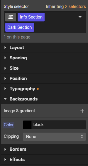
This is now turning the entire info section black as you would expect. And if you remove Dark Section and go back to having just "Info Section", the black color goes away, as you would expect.
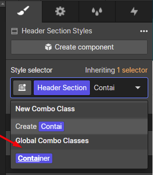
The issue comes in if you think that you can now reuse "Dark Section" across other sections to turn them dark as well.
For example, you might think you can go to the "Footer Section", append "Dark Section" and have the footer turn dark as well. If you do this, however, nothing will happen.
Do you know why? Because you've essentially created a new "combination class" called "Footer Section Dark Section". It can't inherit from that previous "Info Section Dark Section" combination class. It is an entirely new "combination class".
You can however use what are known as "global classes"
Note that WebFlow offers no convenient way to create additional global classes for an element that already has a base class.
It however makes creating combo classes super convenient. Just start typing in the field, and that's your new combo class. Not so for global classes.
So how do you create another global class? It has to be the first (base class) for one element before it can be used as a "global class" for other elements.
In our case here, you have to create a temporary element for no reason other than to create the class, and then you can delete the element.
So you can create an empty div, and give it a base class called "Container":
We can then go to the different sections and add the newly-created class (as an additional global class). You just start typing, and you will notice it appears as a dropdown under "Global combo classes":
However, this isn't the "standard" way of handling containers in WebFlow
If you look at WebFlow tutorials you will see them using the "container element". This isn't a very clean solution for multiple reasons. It creates extra unnecessary divs and nesting.
Also, it is very buggy when used with more modern CSS properties. For example, CSS Grid doesn't work (at all) with container elements.
From what I've seen, more experienced WebFlow developers avoid the container element altogether and just create their own DIVs to act as containers.
For this tutorial, we will build it all out using "the WebFlow" way. That means we will use WebFlow container elements, even though they are quite buggy and not that good.
Don't worry though, I will show you how to refactor it at the end of the article. This way you will understand WebFlow better and why people take different approaches.
Let's continue building out the structure
We'll start by nesting container elements into any parent sections that are contained. If we look at the Figma design, we'll see that the header and footer are constrained to the same 1110px; So we will insert a container inside of those two.
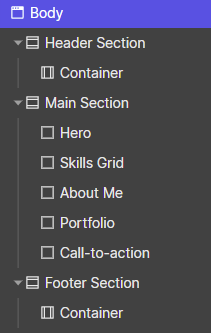
If we look at the main section, we will notice there are 5 elements insdie. Let's look at the first 3

I will refer to these 3 as the "hero", the "skills grid" and the "about me".
And then if we look at the last two:
I'll refer to these two as the "portfolio" and the "call-to-action".
If we go ahead and set up this structure, we'll just need to drag five divs inside of the main section and give them the appropriate names (via the class creator).
And with that, our Navigator will look a little something like this:
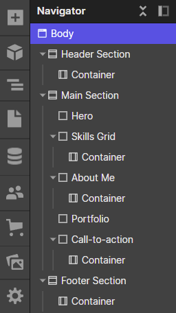
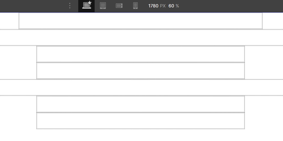
We're not done yet, however! If we look at the Figma design, three of the elements inside the main section are constrained (to 1100px), but the other 2 are not.
This is why we can't just put one top-level container to wrap all elements in the main section. This will result in ins constraining all 5 to be 1100px wide.
Instead, we have to put the container inside of the ones that need it. So we have a container inside the Skills Grid, About Me and the Call-to-action, but not inside the Portfolio and Hero.
And with that, we have our final, overall structure:
I think it looks a bit busy because of all the extra container elements. I would rather not do this, but we'll talk about the alternatives later on.
Let us style all of those containers
A WebFlow container element does have styling by default, but we want to match the styling in the provided Figma exactly, and hence we need to set it to a width of 1100px.
To do so, you can select any of the container elements in our structure, and type 1100 px under max-width, like so:
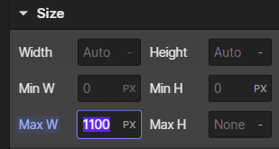
What you'll notice is that when you do this, WebFlow automatically creates a base class for this container (called "container").
This is the default WebFlow behavior anytime you add any styling to any element. If you didn't define a class on an element before styling it, then WebFlow will add one the moment you do any styling.
Side note, the default zoom level of WebFlow might be too zoomed-in to see any of these changes. So I zoomed out by setting it to 60% like so:

With that out of the way, if you applied a 1100px width to one of these containers like me, you will notice it only changed the container you had selected, not all containers. In my case only the top one.
The other containers are using the default width styling defined by WebFlow. To have them also use your custom width styling, just apply the same container class on all of them as well.
Before we proceed, let's get the Google fonts into the project here
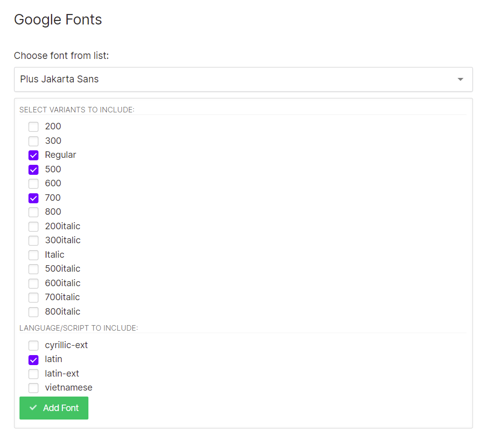
The provided Figma uses the "Plus Jakarta Sans" font from Google Fonts. And the way you add Google fonts in Webflow is usually done like this:
You go to the style panel, and if you click on the font selector, at the very top you'll notice an option called "Add fonts".
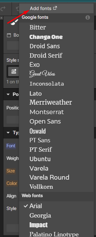
Clicking this option opens a separate screen where you can add the fonts you need. In this case, we need the 500 and 700 weight options for "Plus Jakarta Sans".
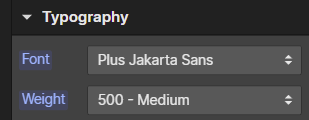
And then, we can set this font on the body. Just select "body" from the navigator on the left, and in the panel on the right set the font and weight (as per Figma).
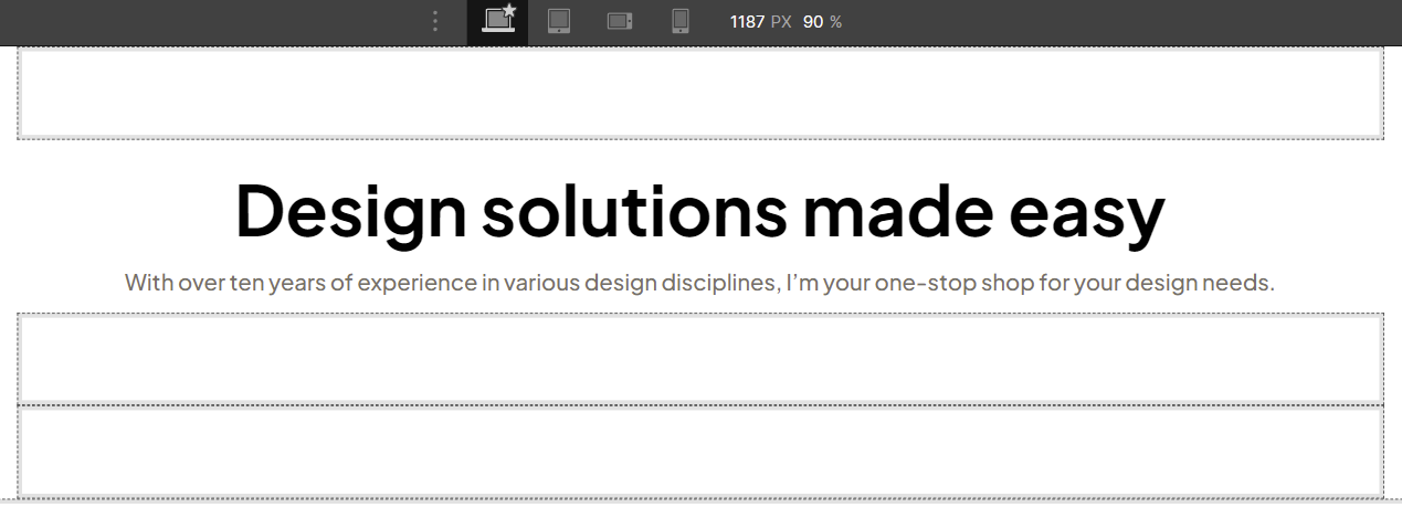
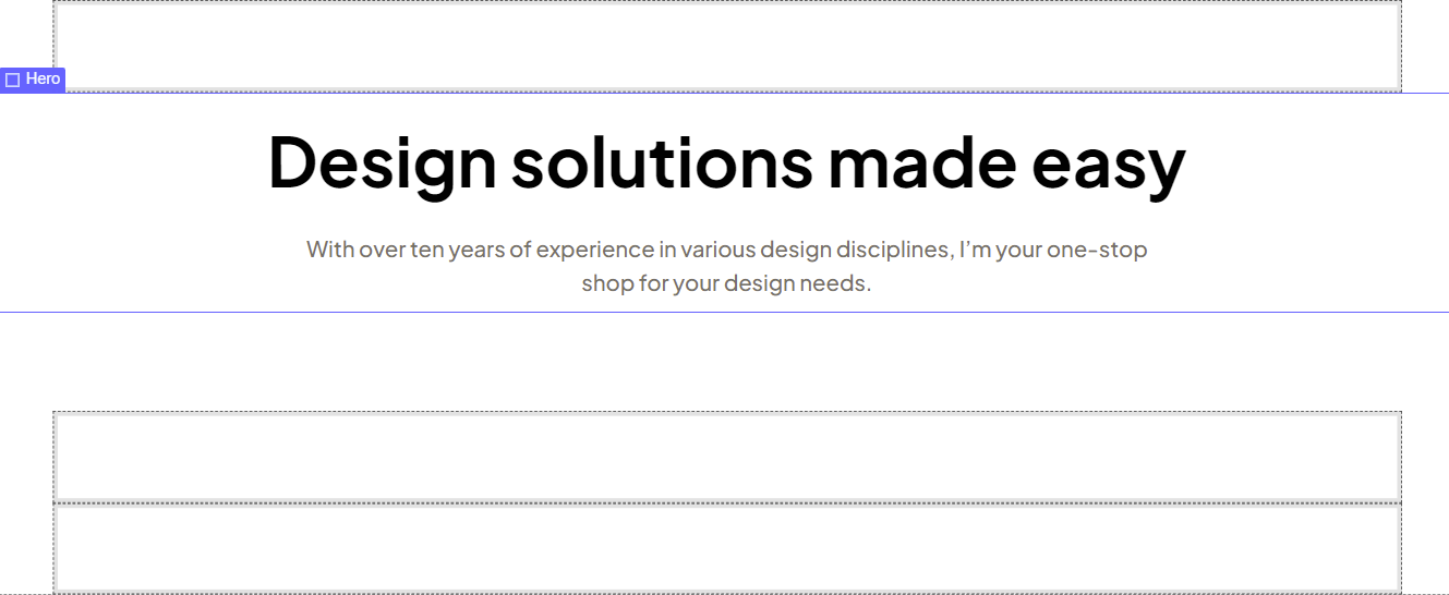
Let's handle the Hero section first
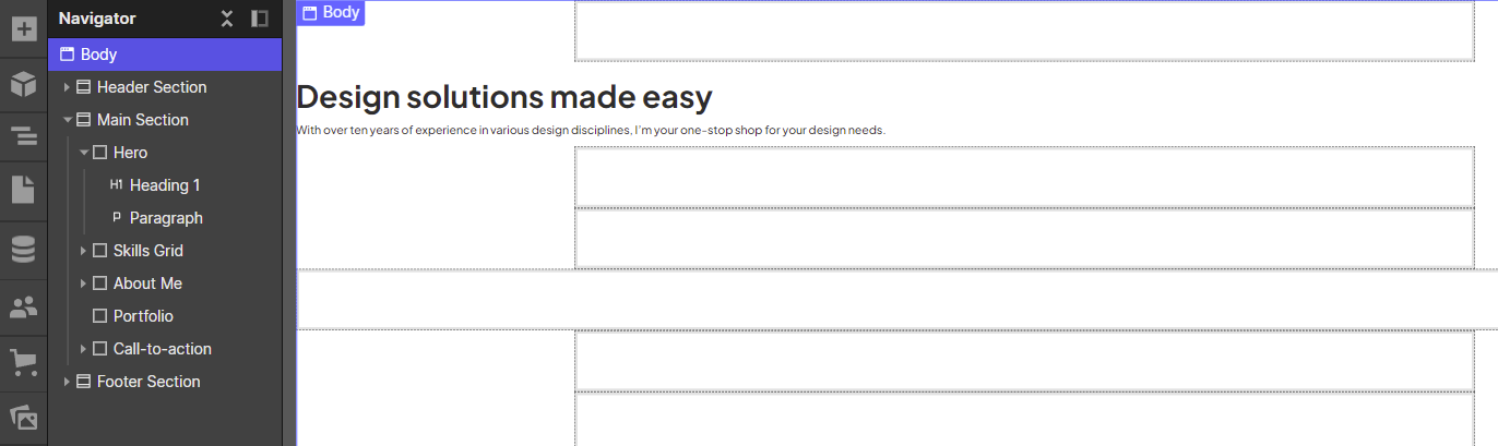
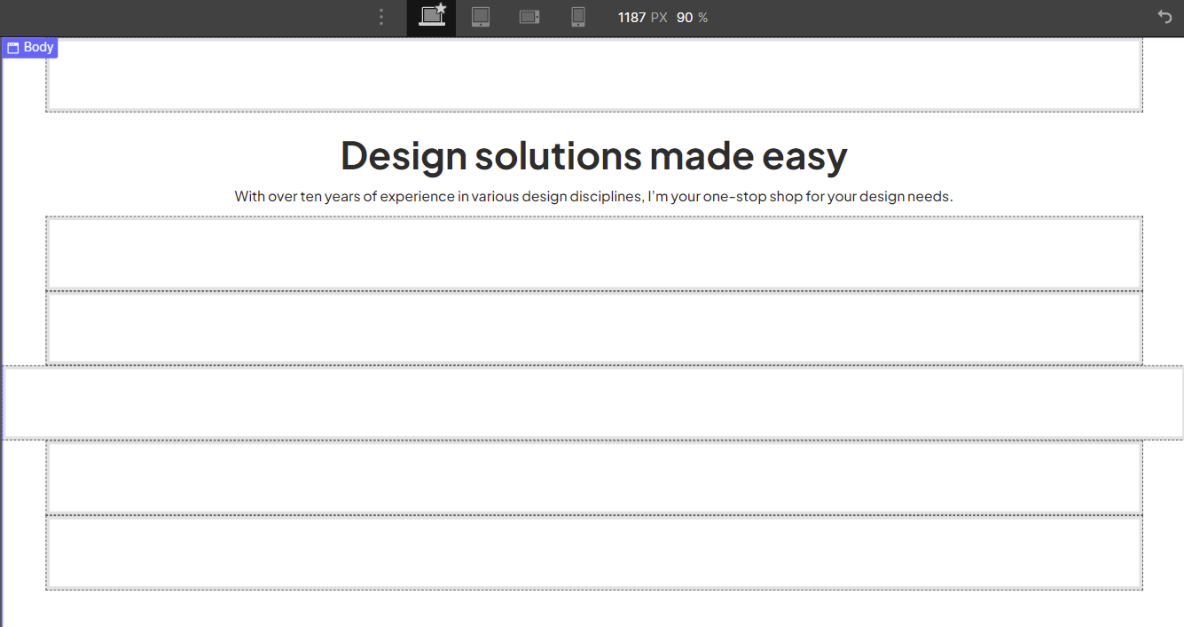
Let's just add a heading1 and a paragraph, with the appropriate content, as per the Figma file provided:
You'll notice it is not centered by default. Which is normal. But before we fix that, I'm going to be changing the zoom level to 90%

In terms of centering everything, the easiest solution here is to just use Flex. Selecting the Hero element, we go to the style panel and choose Flex like so:
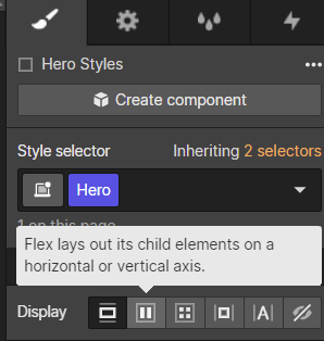
Then choose direction: vertical, and align: center
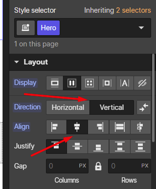
And we're done centering
Before we say we're done with the Hero section, I am going to say we should look at two things, spacing and typography.
Let's handle the typography now
We did assign a global font to match the Figma, but we never checked what the font sizes and line heights are in Figma. They might be completely different from what WebFlow assigned here automatically.
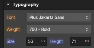
This is what Figma says about the Heading1
font-weight: 700;
font-size: 56px;
line-height: 71px;
/* Black */
color: #030303;
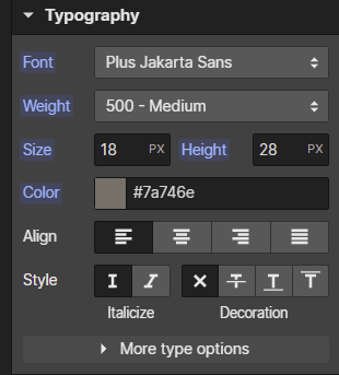
And this is what it says about the paragraph
font-weight: 500;
font-size: 18px;
line-height: 28px;
/* Medium Brown */
color: #7A746E;
We can use this opportunity to talk about the "All" type selector in WebFlow. Whilst we could assign a class on the heading and define the heading-specific styles that way. We can also use the "All H1 Headings" selector so it applies to all H1s on a WebFlow page.
This is pretty straightforward. Just choose the H1 element, and you will see that option pop up on its own if you put the cursor inside the style selector.
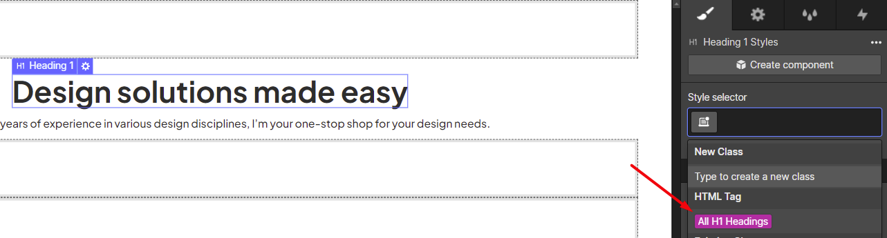
We can then set the values the same as in the Figma
A note about REM units and typography |
When I am recreating designs from a Figma file I prefer to initially copy everything in pixels and then convert to REMs at the end of the process. I find this more productive than stopping to pull out a calculation in the middle of a Figma conversion process. I'd rather do these unit conversions all at once later on. |
Let's do the same for the paragraph. Looking at the Figma I notice the other paragraph on the page also uses the same styles, so I think we can just define this styling on the body.
Just select the body from the Navigator, and set the Typography settings to match the values we saw from Figma above.
Already looks better:
Let's now handle sizing and spacing
To match Figma fully we'll want to give a fixed size to the paragraph by selecting and typing out 730px like so:
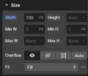
This is going to automatically create a class called "Paragraph", however, I think this can be confusing.
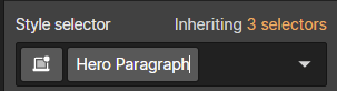
We only want to apply this styling to this one paragraph, not all paragraphs on the page. So if we click on the class we can rename it to "Hero Paragraph".
After constraining it, we notice we're missing a center-align for the text itself

So let's do that as well:
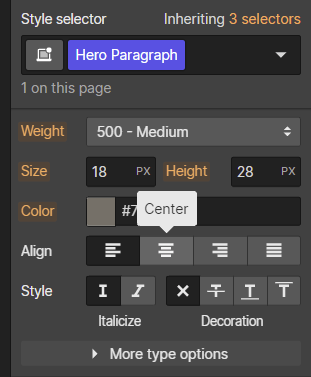
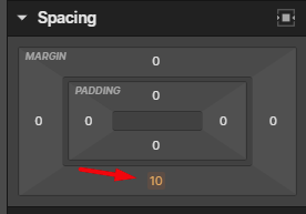
Let's also make sure the spacing matches the Figma perfectly as well. If we look at the bottom margin of the heading in Figma, we see that it sits at 23px
If we select the Heading1 element in WebFlow again and go to spacing, you will notice something interesting:
The bottom and top margins are amber-colored. This is telling you that it is inheriting these values. To see where from, click on the amber value. In this case, let's find out where the bottom margin is coming from:
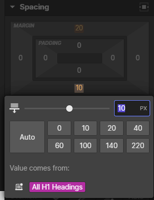
You will see it says "Values coming from the "All H1 Headings" styling. Now, in terms of what to do here, there is no wrong answer.
We can go ahead and set the 23px bottom margin right here while we have the heading selected. That will auto-create a "Heading" Class.
Or you can go to the style selector and choose "All H1 Headings". And then set the margin-bottom value. This will set it for all H1 elements on the page.
In the case of this design it doesn't matter because there are no other H1s in this project. But let's go with defining it for this one specific heading element. If you do that, you will see that it auto-creates a "Heading" class.
Before we continue with the next section
I always like defining the margin-bottom of one section, before I can say I've completed it and move on to the next section. In this case, Figma is telling us that there is 80px of space from the hero section, to the next section. So let's put that in the margin-bottom for the Hero section as a whole.
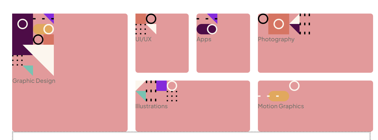
Let's do the "skills grid" next
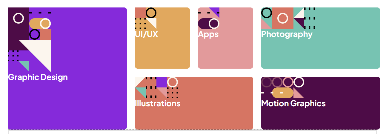
It's a good idea to handle the structure first before we do anything else. Let's look at the reference Figma design again...

As you might see we need 6 of these "skill blocks" inside of this grid. So we'll just need to put in 6 divs inside of a parent element which we will define as a grid container. But which element should be defined as the grid container? Well, the answer with WebFlow is not that simple...
Grid issues with containers in WebFlow
If this was raw HTML and CSS we could simply have this section, give a the container class, and also a "skills-grid" class.
<section class="container skills-grid">
    Grid Elements Here
</section>
Unfortunately due to what we discussed before - the "WebFlow way" involves using container elements instead. So we must put a container inside of the section. But we can then set that container to be a grid, right?
No, not quite. WebFlow has had a bug (since at least 2020) where Grid doesn't work properly on containers. So we have to nest one more level deep.
So, we have a "Skills Section" and inside of it we have a "Container" element, and then inside of it, we have another div that handles the grid stuff.
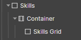
Note that when we originally set up the sections, I called the section itself "Skills Grid". But I think we need to rename it to just "Skills" because we'll need the name for the innermost div instead.
Once you've renamed the section to just "Skills", put a new div inside of the container, and name that innermost div as "Skills Grid". So you should end up with this structure:
Now, let's put in the markup for the actual skill blocks
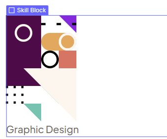
Let's put those divs in, with all of the necessary content. That includes an SVG, and a piece of text with the name of the skill, for example, "illustrations" or "photography".
A lot of people would look at these pieces of text and think "h3 headings". However, semantically it's a bit weird to do that because you're not supposed to skip heading levels (h1>h3).
They also don't make sense from the perspective that it's more like a label than a heading that defines a section. A more appropriate example of what is heading can be seen from the heading that comes after the grid. That one defines an entire section and its content.
So, in this case, I decided to look at these as "labels", not headings, so I will be using a paragraph element when creating the structure for each skill block.
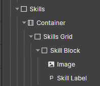
With that said, I'll use one trick to speed things up. Since I know that I'll want all 6 of these to be a div with the "Skill Block" class, I will first create one such div.
-> Place div inside the container inside of the "Skills Grid"
-> Give it a "Skill Block" class
-> Inside put in one image element and one paragraph element
-> Assign a "Skill Label" Class to the paragraph
Next, we can choose the image by clicking on the cog on top of the placeholder image like so:
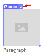
-> I chose to use the image and text for the first skill in the grid, like so:
- Finally, just duplicate this block 5 times (ctrl-d)
Next, we can replace all the content with the actual appropriate content. So replace 5 of the images and labels with the final ones as per the Figma design.
Let's create the actual grid
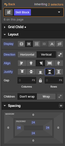
Select the "Skills Grid" div and select grid from the display options, like so:
Doing so immediately enters you into Grid Mode:
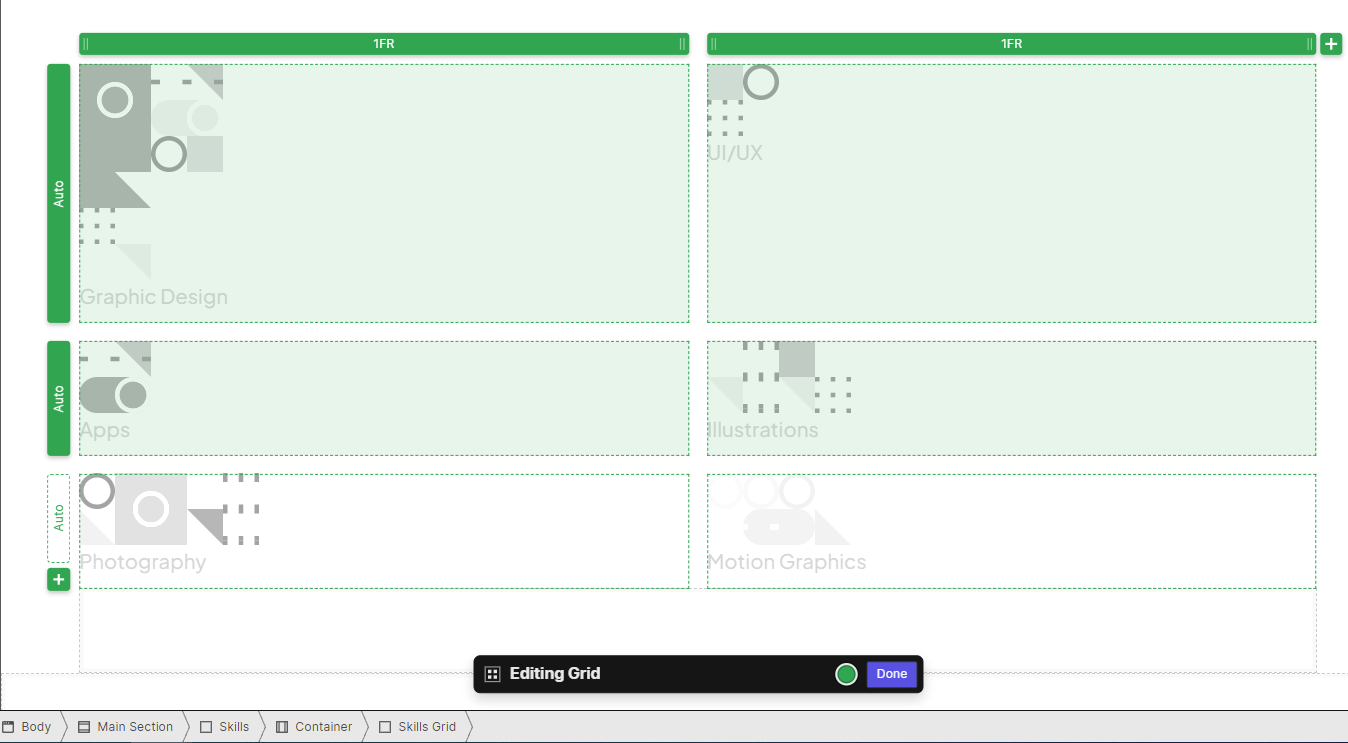
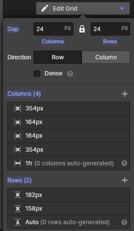
The first thing I would do here is to define the columns and rows to match the Figma design, like so:
Next, we can proceed to define the CSS grid areas to match the Figma design. You define an area by clicking the "Add Area" button like so:
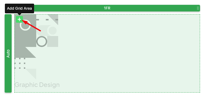
Then you can click on the "area" button to give it a name and choose its span. For the first cell, we will do this:
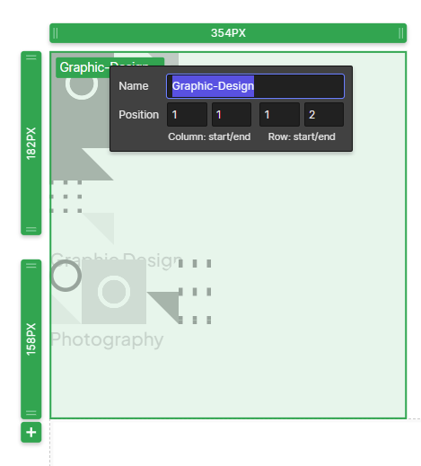
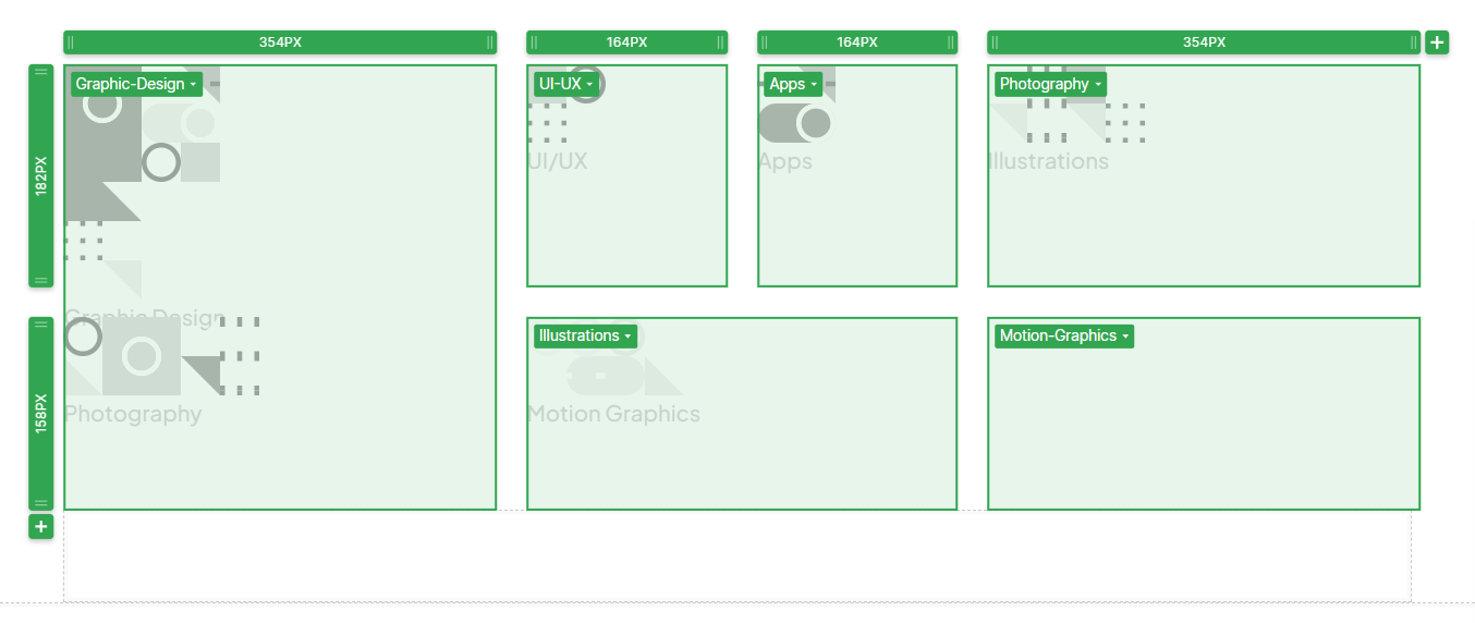
If we then go and define all the areas, we will get something like this:
The next step would be to assign different skill blocks to different grid areas. But before we do that let's take a small detour.
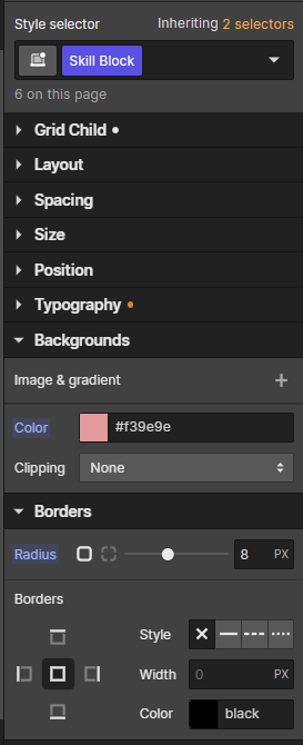
I would like to give the "Skill Block" class a background color just so we can see what we're dealing with. I am going to use a border radius which we need in the final design anyway, and just choose to apply one of the design colors to the background.
background: #F39E9E;
border-radius: 8px;
The equivalent settings in WebFlow look like this:
After doing this, we can see what skill blocks we are working with. However, it looks weird and they don't seem to fit into the grid in any meaningful way.
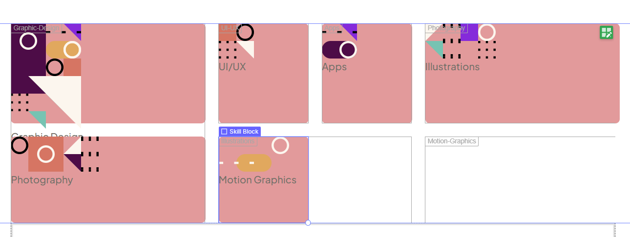
Don't worry though, everything will look great once we assign them to grid areas we defined earlier.
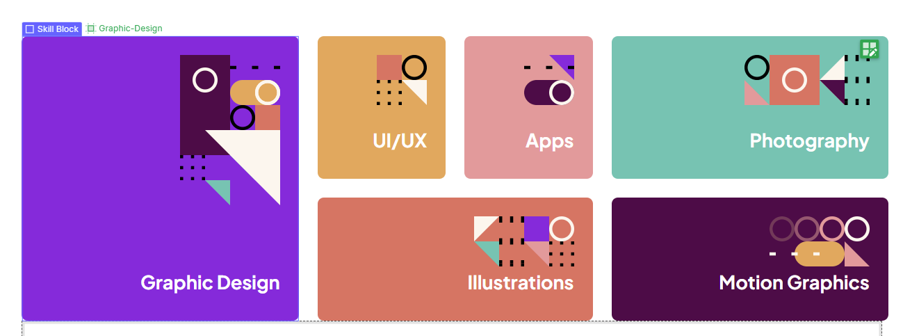
For example, if I choose the div with a "Graphic Design" label, I can go to the grid child settings and choose an area. In this case, I just choose the area we defined previously as "Graphic-Design":
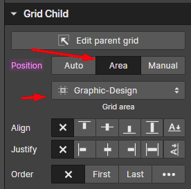
With this, you will see things already look better
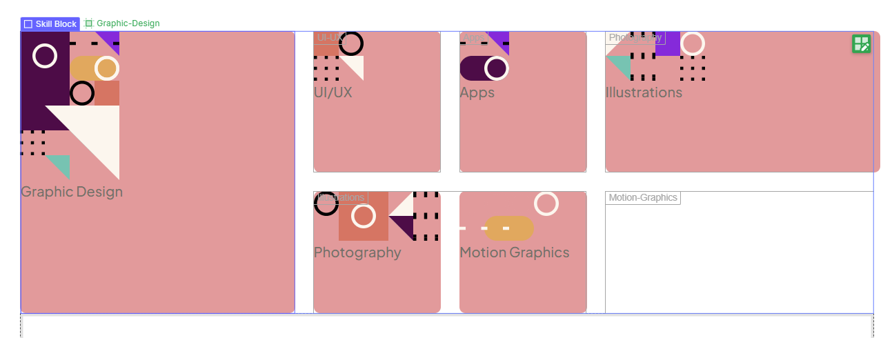
But let's assign an area for the rest of the skill blocks as well:
Let's handle some skill block styling
I think this is a good time to insert the actual colors for each block. We can do that by just adding a combo class to each skill block and setting the background color. So for example for the "graphic design" block we do this:
If we apply the appropriate colors for all blocks, we get this:
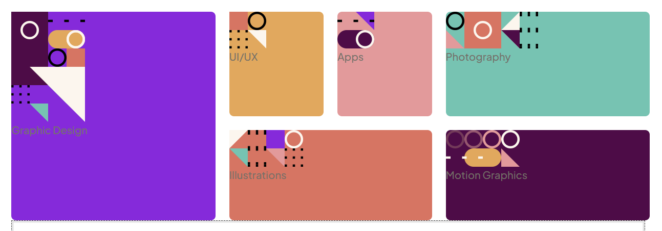
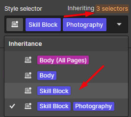
And we see an obvious issue. It is time to set the text color. However, if you choose a block (for example the photography block) you might see an issue.

You will see that it shows you the "class combo", which means that setting a text color here will only affect that combination. In other words it will only affect the photography block. How do you choose just the "Skill Block" class?
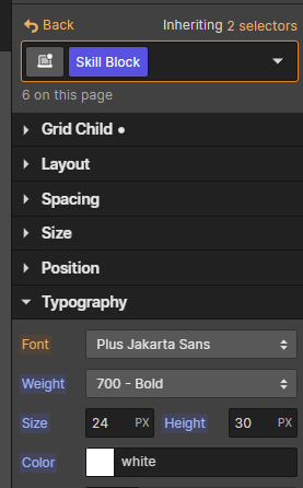
We can then set the text color to match this Figma-provided information
font-weight: 700;
font-size: 24px;
line-height: 30px;
color: #FFFFFF;
Like so
And now, we're almost there:
To get the actual layout, we need just a few more tweaks. We can turn the "Skill Block" into a flex, set align to "end", and then justify to "Space Between".
And we're almost there
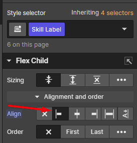
We just need those labels to go to the left. This is simple. Pick any label on the screen. And under "Flex Child" set it to "Left":
And with that, it seems like we might have accomplished the look
However, if you're good with attention to detail, you might notice these labels are higher than in the Figma file. To find out why just go to the panel and you will notice they have a margin-bottom they are inheriting.
If you click on that amber-colored number, you will see it says that it is inherited from the "All paragraphs styling".
It is up to you if you want to remove the margin-bottom from all paragraphs (similar to a CSS reset) or if you want to remove it just for "Skill Label". In either case, once you do that, the grid will match the Figma precisely.
Before we continue with the next section
Let's add the margin bottom for the skills section. Figma tells us there is 136px of space between the skills section and the next section. So let's set that value now.
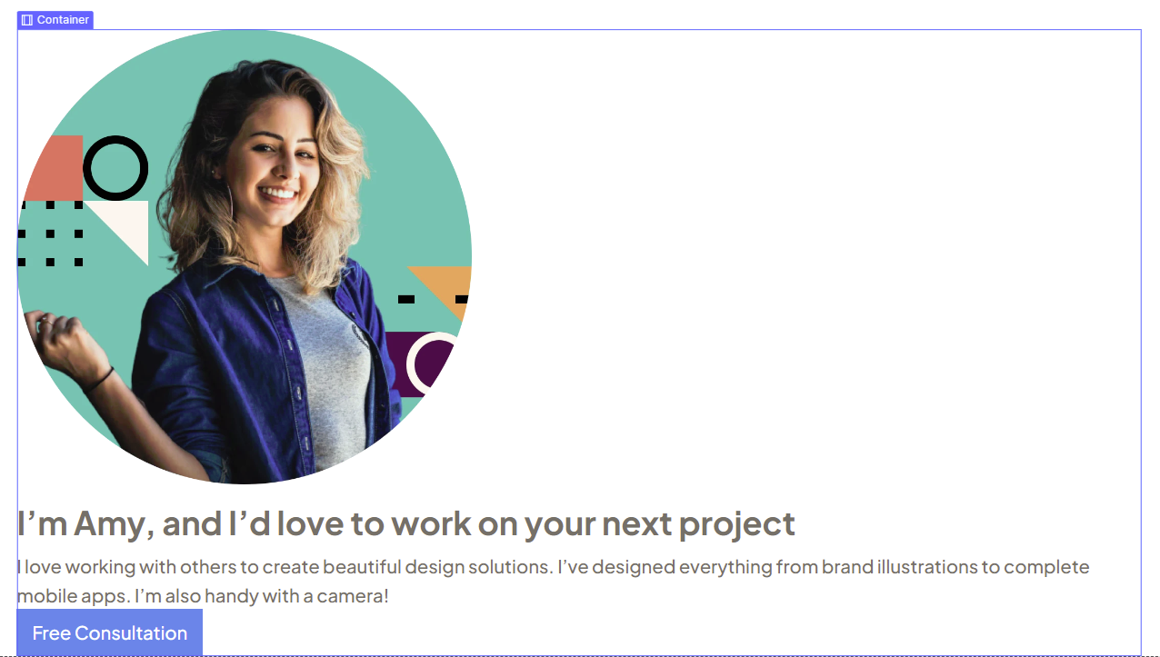
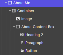
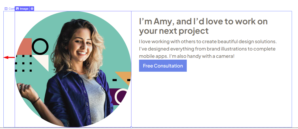
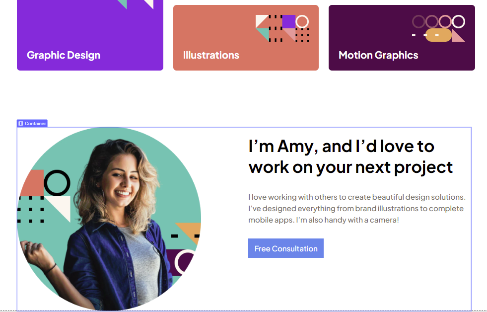
Let's do the "About me" Section
As a reminder, it looks like this

I think this part is relatively straightforward, and if you've followed along, you should probably already guess how this will be done. Let's go ahead and do this part as well. We'll set up the structure first, which includes the image, heading, paragraph and button.
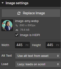
If you're following alongside me and using the FEM-provided assets, you probably ended up with an image so huge that it barely fits the editor. Let's fix that one first by selecting the image and setting its width and height to match the Figma.
And with that, our about-me section is starting to get somewhere
Time to handle the "About Me" layout with Flexbox
Unlike CSS grid, you can use Flexbox on a container element. It's less buggy and most flex options work on a container element. So we won't create more divs like we had to with the grid thing.
However, if we want the flex options to only apply to this container, we have to give it a combo class.
You will notice that if you select the container it tells us that it has "Container" as the base class.

If you go ahead and immediately set it to Flex, then all containers on this page will turn into Flexbox. Not what we want.
So just go to the style selector, and add an "About Me" combo class:
A note on naming |
If you are astute you might have noticed we're naming this combo class "About Me" even though we already have a base class named "About Me" applied to the section element. |
With this, we can now set things to display as flex and immediately notice this weird result:
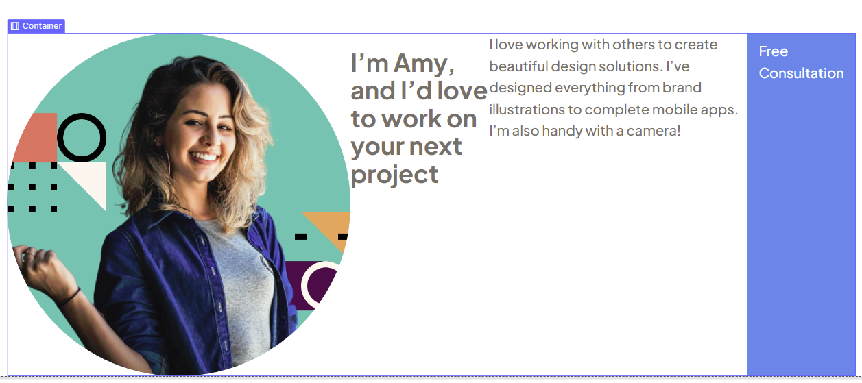
The issue is that by default flebox is set to horizontal. So is the solution flipping this flexbox to vertical? Well no, because then the image will stack on top of the 3 other items. We want the image on the left, and all the other stuff on the right.
So the solution is adding more markup. We want to place the heading, paragraph and button in a new div we will call the "About Content Box".
We can also set the content box to a width of 540px as it is in the Figma file, as well as set the container flexbox setting to "Space Between".
However, due to another WebFlow container bug, "space-between" doesn't work how it should work either. The two elements inside of this container are not sticking to the side. There's quite some space before the image:
For now, we can fix this by setting a gap of 115px which will give us the same look as in Figma.
How did I get this value? In Figma the space between the image and the content box is 125px. That value makes the image overflow a bit, so lowering just a bit to 115px turned out to be just right.
To avoid resorting to these hacks, the only real solution is to not use WebFlow's container element at all. This is something we will look at after we're done building the page. At the end of the article.
Let's handle the content box stylings
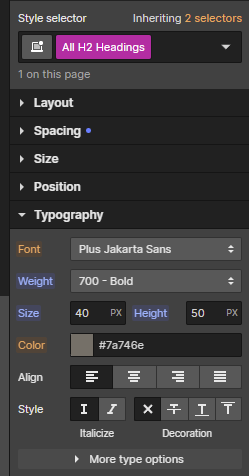
If we look at the Figma we'll notice there are two H2 elements, and they're both the same font size and line height, but different colors. So we will go ahead and define the font size and line height on the "All H2 Headings" selector, like so:
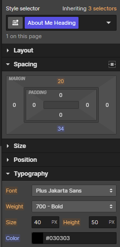
Next, we'll give it a dedicated "About Me Heading" class, and assign the color on there. But while we're at it, we'll also set the margin-bottom to a value of 34px. This is to match the space seen in the Figma file.
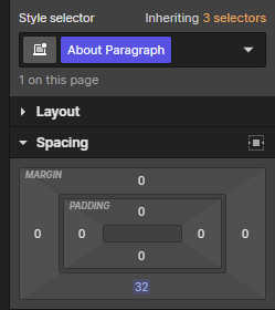
Next, we can select the paragraph, give it an "About Paragraph" class, and set its margin-bottom to 32px as per the Figma:
And with this, we're practically done with the About Me section.
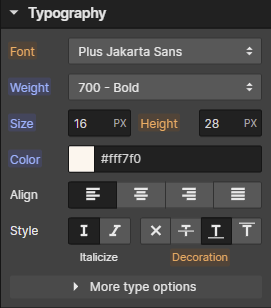
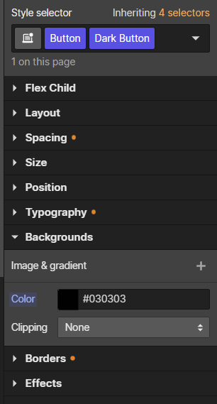
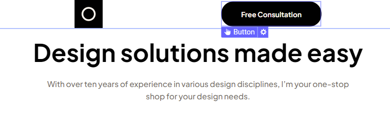
The only thing left is the button which currently has the default WebFlow styling. Doing that is simple. We just select the button and start copying the value from Figma. It is primarily about copying the padding values, border radius and background color.
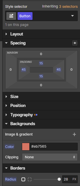
But also copying the typography values:
And with that, the "About me" section is done:
Before we continue with the next section
Let's add the margin-bottom for the "About me" section. Figma tells us there is 136px of space between the skills section and the next section. So let's set that value now.
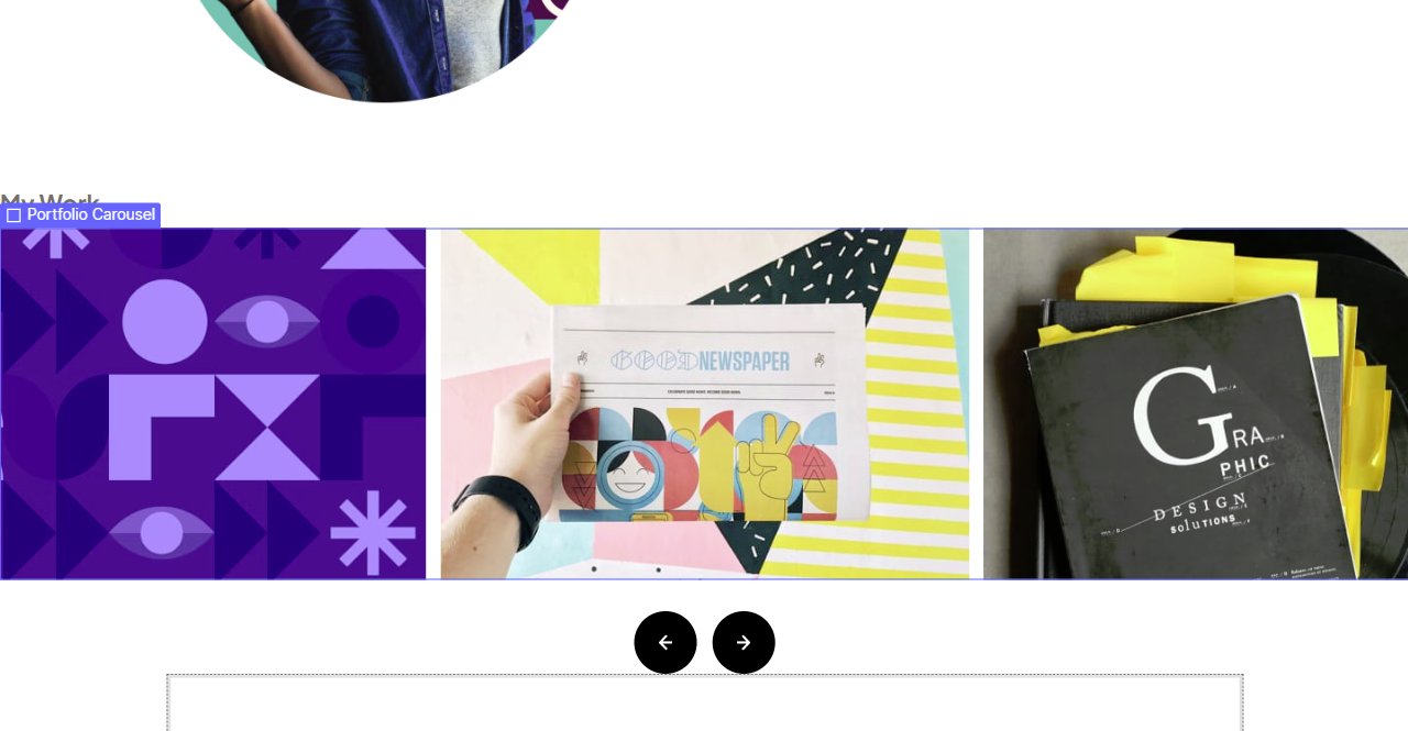
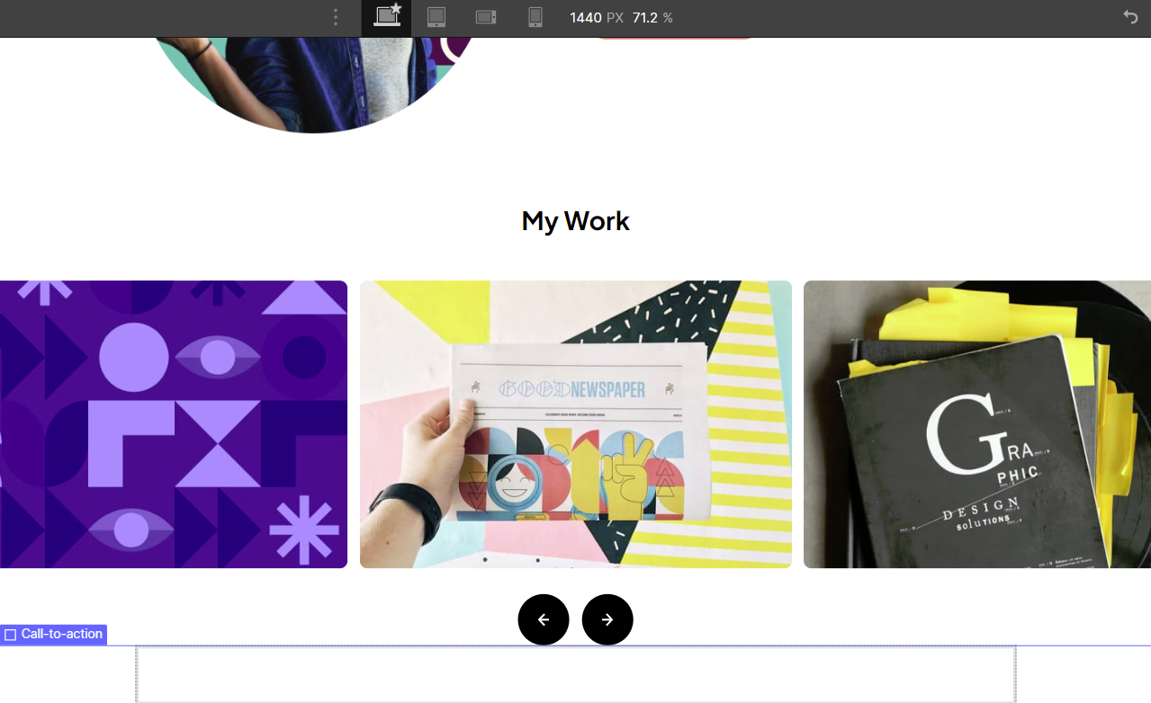
Let's do the "Portfolio" Section
In the challenge, we're given a task to create an interactive carousel. As the user clicks previous or next, it should slide the carousel forwards or backward.
You can find my solution on the GitHub repo for the raw HTML solution to this FEM challenge and see how I built a custom carousel in plain JavaScript.
However, since this article is focused on the copying of a design from Figma to WebFlow, we will only be recreating the look of the carousel and not the interactivity.
I will however publish a separate article on building an interactive carousel like this in WebFlow.
Let's set up the markup for this section
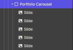
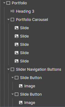
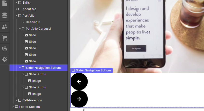
First the top-level stuff. A heading, a div for the slider and a different div for the navigation buttons:
Next 5 image elements with a class of "Slide":
And then two divs with a "Slide Button" class, and an image inside. The images are provided by FEM as a right arrow asset and a left arrow asset.
Next, we will style the navigation buttons. Since we're just repeating things we have done before, I will only share the CSS equivalent that we need to replicate in WebFlow. You should know exactly how to set them in WebFlow by now:
.slide-button {
    background: black;
    display: flex;
    align-items: center;
    justify-content: center;
    width: 64px;
    height: 64px;
    border-radius: 50%;
    cursor: pointer;
}
The only thing that we haven't covered before is the cursor property. You set that by going to the Effects panel in WebFlow. You will find it at the very bottom like so:
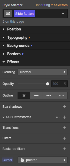
And with that, the buttons look styled:
Though we do need to handle the layout using Flexbox. Just replicate these values in WebFlow:
.slider-navigation-buttons {
    display: flex;
    justify-content: center;
    gap: 16px;
}
Next, let's style the actual slider, by replicating these CSS properties in WebFlow:
.portfolio-slider {
    overflow: hidden;
    display: flex;
    justify-content: center;
    gap: 15px;
    margin: 0 auto 32px;
}
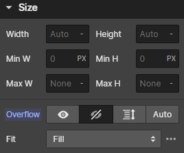
The only thing we haven't discussed until now is the overflow setting. Why are we doing this, and how do you set this overflow setting in WebFlow?
Well, FEM wants us to create the Carousel in such a way that the slides "spill out of the screen" - at least at the 1440px breakpoint.
We are looking at the carousel in the Figma file here. Please note the width of the container. It's quite wide. This is because all 5 slides are in there, even the ones that are off-screen.
You will commonly see this in Figma designs where the designer is defining something that goes off-screen. They will include the elements that are outside of the screen as well.
This is a good idea because this is generally also how you build things on the HTML side. Even the items that are off-screen exist in the HTML, they are simply off-screen.
To achieve the effect needed here, all you need to do is create a div, put the 5 slides inside, and set it to flex.
However, by default, browsers want to let the users have access even to the content that "spills off-screen". So browsers add a horizontal scroll bar.
In the case of a carousel we don't want to get the horizontal scroll bar. This is why we add overflow: hidden. And if you want to find this option in WebFlow, you can find it under the Size settings.
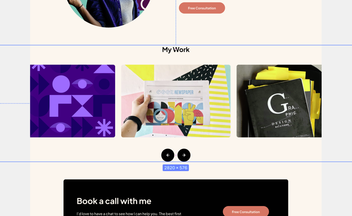
With all of that said, if you applied all the properties I shared with you, then you should have a result that looks like this:
Only two things left for us to do in the Portfolio section. We need to style the actual slides, as well to style the h3 heading.
Here are the CSS equivalents you need to set in WebFlow
h3 {
    font-weight: 700;
    font-size: 32px;
    line-height: 40px;
    margin-bottom: 56px;

    /* Black */
    color: #030303;
}
    .slide {
        width: 540px;
        border-radius: 10px;
    }
As you might guess, all of these values are coming from the Figma file. And with that, the portfolio is fully reproduced in WebFlow:
Note again |
In this tutorial, we're just reproducing the CSS of the carousel. Adding interactivity will be a separate article. In it, we will discuss how we can animate the carousel based on user interaction. |
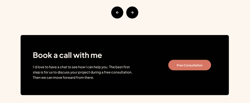
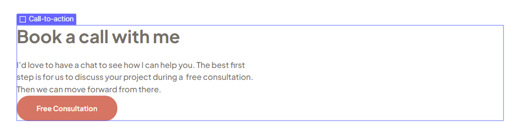
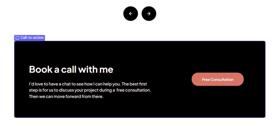
Let's handle the call-to-action section
As a reminder, this is the black box beneath the navigation arrows.
This one is going to be the fastest so far, I won't explain anything, since by this point you should be an expert at taking Figma-provided values and converting them into WebFlow markup and styling properties.
If we handle the structure and needed elements, we'll get the following
Productivity tip |
Since the button in this section is identical to the one we used in the "About Me" section, you can choose that button and duplicate it (ctrl-D), and then just drag it into this new "Call to Action" section. You can drag things around either in the editor, or the Navigator. |
Next, let's handle the styling to match the Figma
.call-to-action {
    border-radius: 10px;
    padding: 80px 95px 80px 65px;
    display: flex;
    flex-direction: row;
    align-items: center;
    justify-content: space-between;

    /* Black */
    background: #030303;

    /* Light Cream */
    color: #FFF7F0;
}
And the result is... Well, kinda weird.
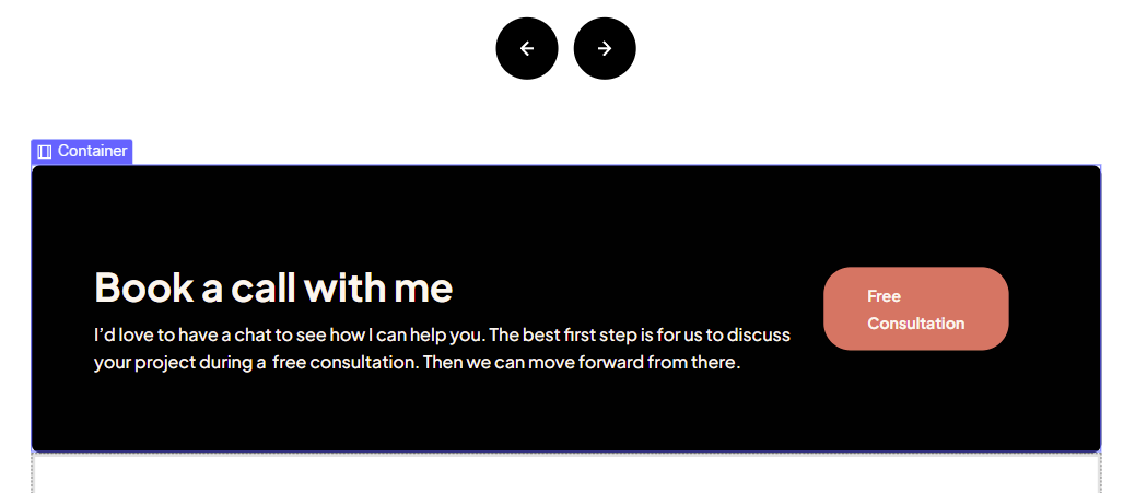
First, we need to give the text a fixed size, as it is in the Figma. This both improves legibility and lets the button take up more space.
    .cta-text-content {
        width: 540px;
    }
The second thing we need to deal is with the bugginess of Flexbox applied to a WebFlow container. We already dealt with this by playing with the gap in the About Me section. I'm not going to do that here.
The reason we can't reproduce the Figma design for this box is that "space between" doesn't work properly when applied to a "container" element. Those bugs don't happen if you implement a custom container solution and avoid WebFlow's container element.
For now, we'll leave the buggy flexbox in there, and get this result:
The button looks weird. We could hack it into proper alignment playing with gap values. But I'd rather just avoid WebFlow's buggy container element as you can get the necessary look just fine by just applying space-between to a non-buggy container.
Before we move on, let's just handle the spacing
We'll give the heading a margin-bottom of 24px
And the cta-section itself gets a margin-bottom of 56px
Finally, let's do the header and footer
I left these two for last because they show us why we need to refactor and abandon the WebFlow container element.
Now, the design gives us an identical header and footer. We can just do everything on the header, and then just duplicate for the footer.
The structure:
The "CSS":
header .container {
    display: flex;
    align-items: center;
    justify-content: space-between;
}
And with that, we get the following look:
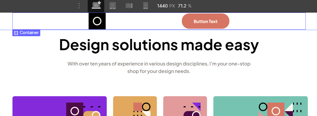
Again, the WebFlow container is a weird thing that results in a bunch of space on the sides, even though we have selected space between. We could hack it with a flex gap, but we won't, as we can just refactor and abandon the WebFlow container for good.
Let's just give the necessary text to the button, and style it like so:
And we're done...
At this point, you can just duplicate the container inside the header and move it to the footer.
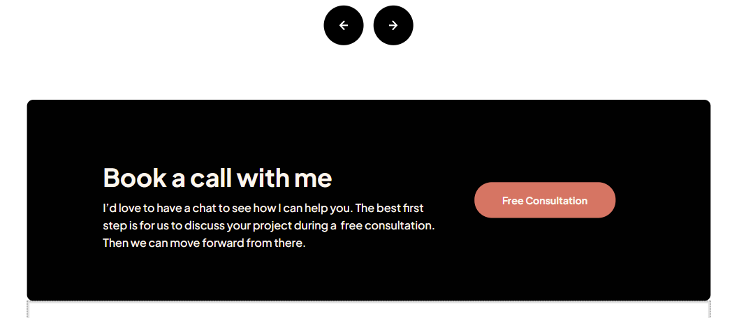
The long-awaited container refactoring
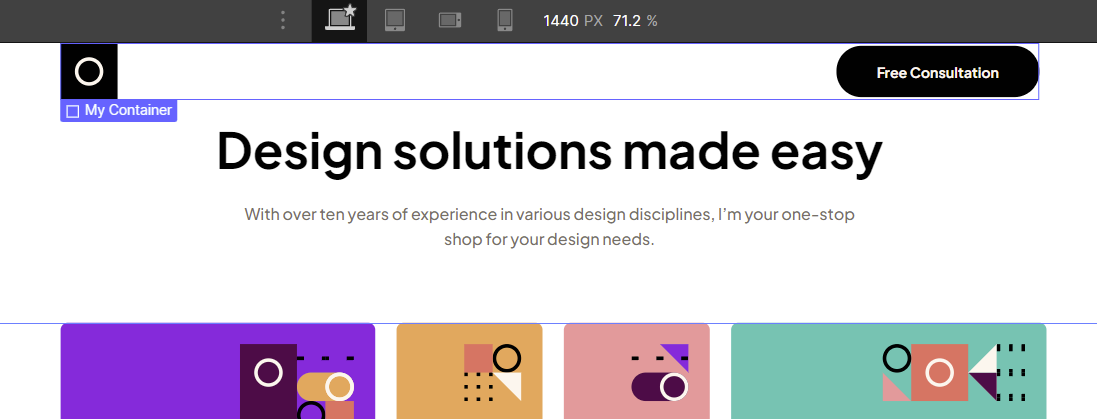
There are two ways to go about this. I'll try both options just to demonstrate this. First, let's handle the header container because that one produces the worst issues.
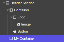
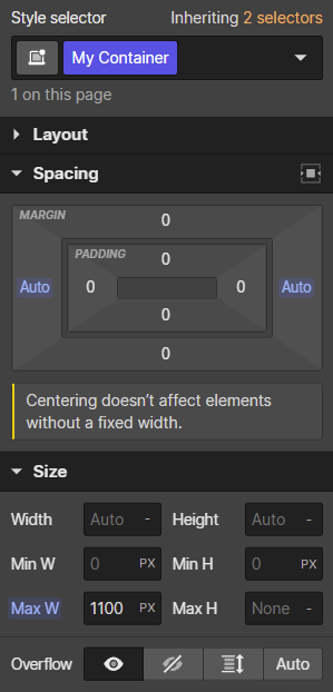
What we can do is create a new div, and let's give it a class of "My Container". Just because "Container" is already taken. Obviously, if we were building from scratch we could just name it "Container".
Set the side margins to auto, and the max-width to 1100px:
Move all of the header container elements over to our new custom container, and delete the WebFlow container element:
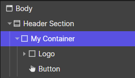
Then apply the Flexbox properties we applied earlier to this header "My Container":
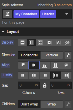
And magically, this time flexbox works as you would expect it to:
Let's use the other approach to handle the container for the call-to-action section
The other option involves skipping nested divs altogether and using the container-class pattern as you would in regular CSS. You just need to create a special global container class that you can later apply to elements.
So let's create a temporary div just for this and give it a base class called "Container Class".
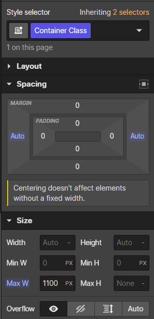
Again the reason I'm calling it a different name is because "Container" is already taken. In a new project, you could just call it "Container".
Then, let's head to the call-to-action section which currently uses a container element...
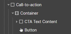
Let's move the stuff outside of it, and delete the container:
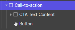
Now, let's apply our new fancy "Container Class" to the CTA section:
And that works to contain our entire section to 1100px:
We did lose the styling we had before. That's because we had defined it on the container element. We can style the same way we did before just adding the styles here.
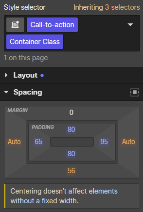
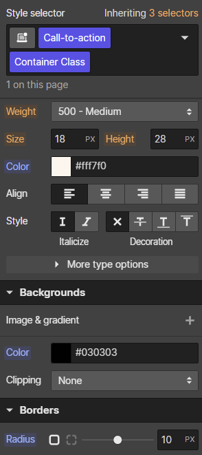
If the above confuses you, please note that when we add these styles they're not added to either the "Call to action" class or the "Container" class. When both are selected, this is a "Combo class". It is the same as if you were styling a class called "Call-to-action Container Class".
And that worked, we're matching the Figma exactly now:
And with that, we are done
This is a Chrome screenshot from my WebFlow conversion, but if you followed along, you should have also gotten an identical, pixel-perfect conversion as well.
Let's Connect
If you find any of this article helpful, feel free to subscribe to this blog here, or connect with me on LinkedIn. I am growing my LinkedIn profile at the moment, and love connecting with everyone.


