Creating a pixel-perfect conversion from Figma to WordPress, using Oxygen Builder

Frontend Mentor provides some tricky challenges that test your ability to recreate designs from a provided Figma design. They are tricky to reproduce, especially if you want to do a "pixel-perfect conversion". I love doing these challenges as they help you improve your "CSS intuition".
However, as an extra challenge, I decided to see if I can't also complete these challenges using Oxygen Builder. This is a WordPress page builder aimed at web developers. You can think of it like "WebFlow for WordPress"
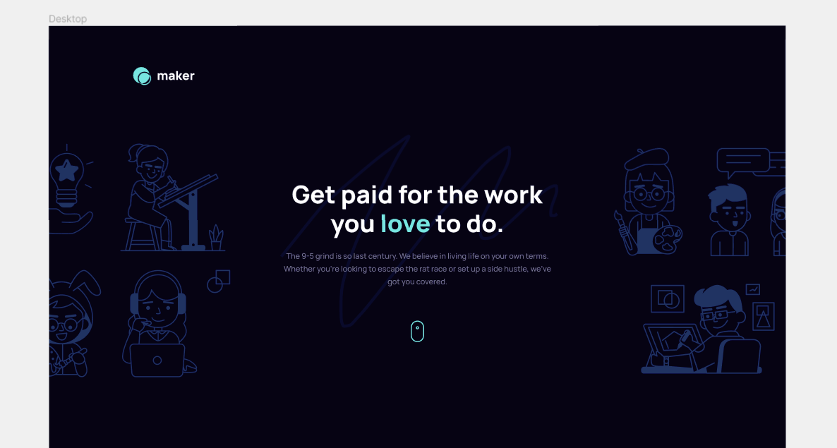
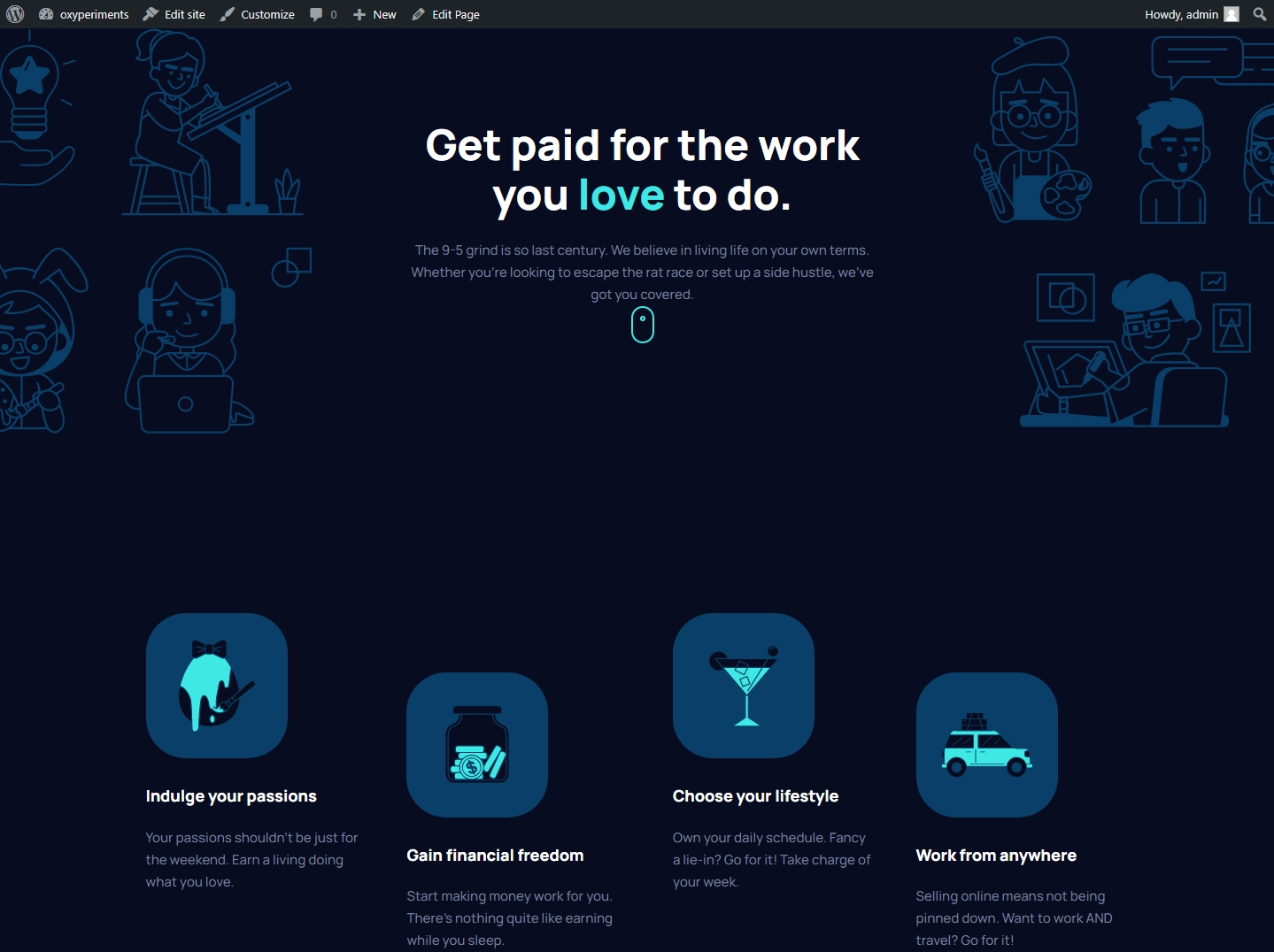
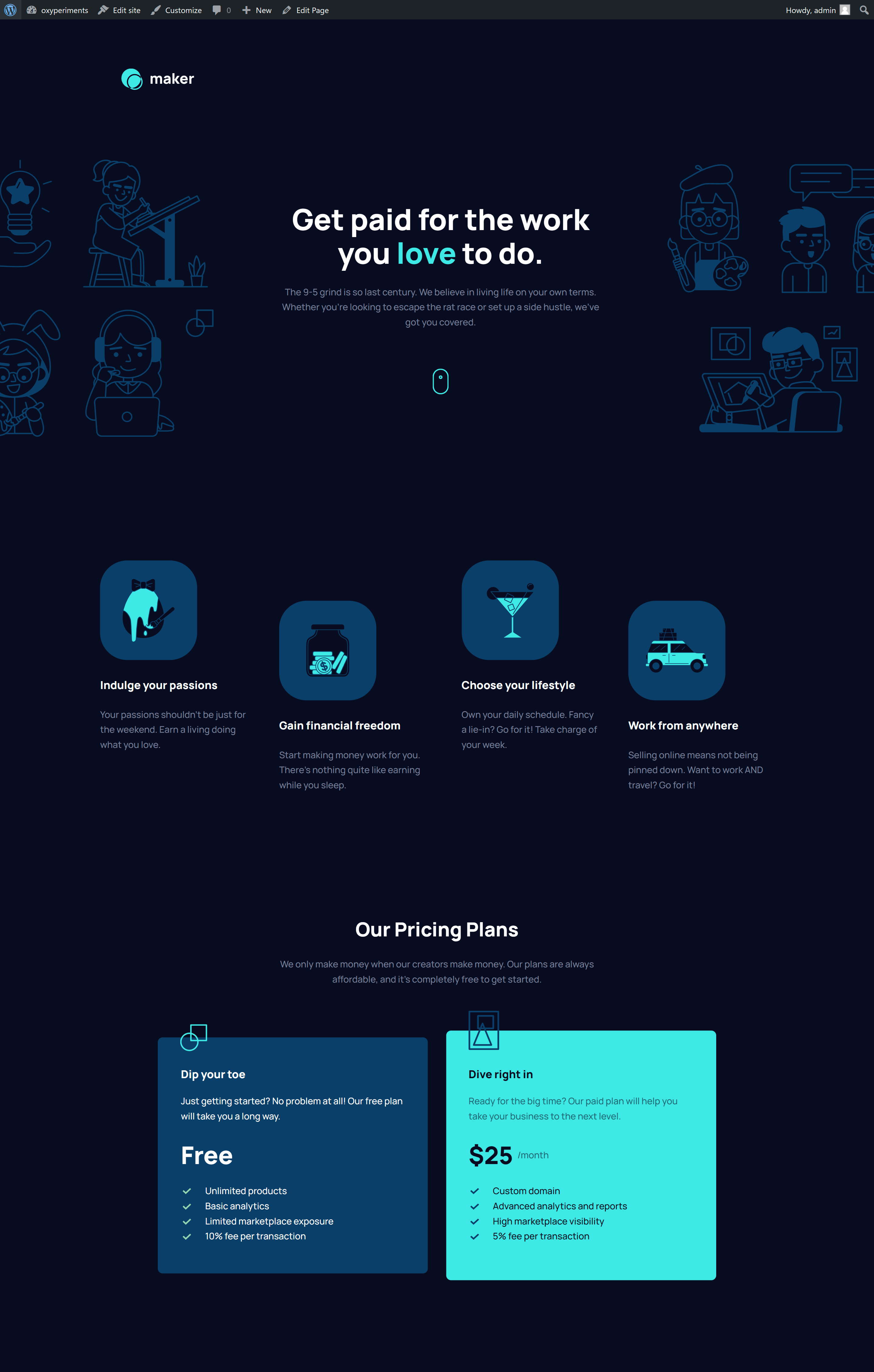
My goal is to force myself to learn and understand the native Oxygen workflow as much as possible, which means avoiding going into the custom CSS unless I have to. To start with I chose the Maker Pre-Launch Landing Page challenge, and this is the design we'll be recreating inside this article.
Goal:
We need to recreate the design just using native Oxygen settings, features and options. We're only allowed to resort to the custom CSS options when something cannot be achieved from the main Oxygen UI.
The design challenge that we're given
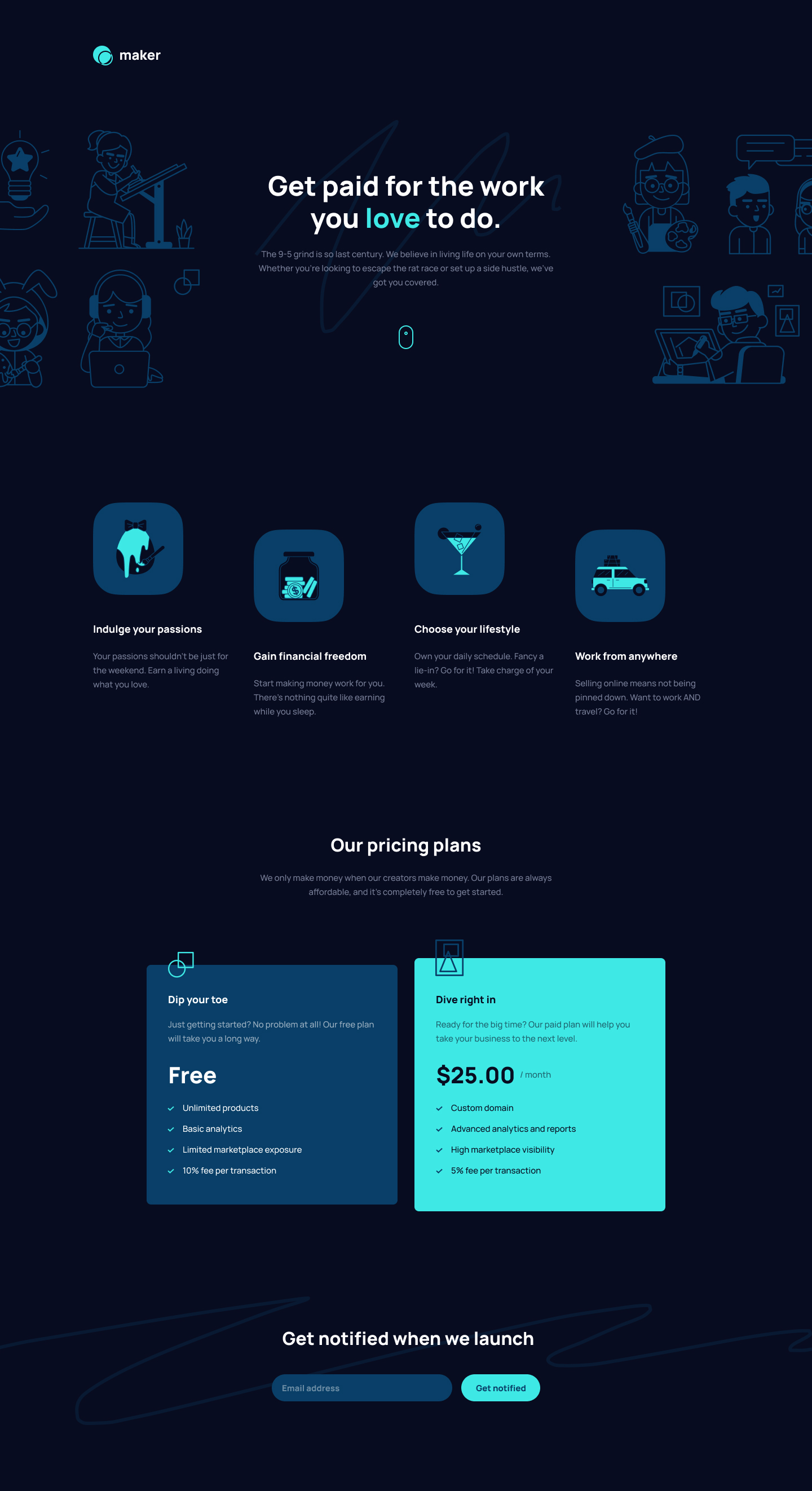
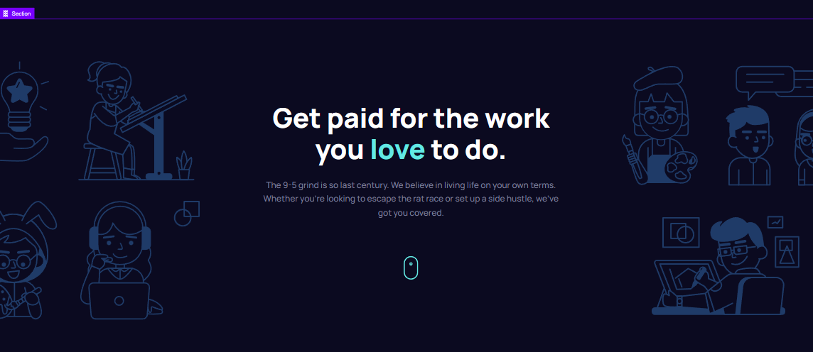
This is the design we need to recreate. I've already finished this challenge in raw HTML and CSS. My challenge here (again) is seeing what it will take to achieve the same using Oxygen Builder.
Let's talk about pixel-perfect vs responsiveness
The Figma file we receive from Frontend Mentor has a desktop layout set at a width of 1440px. It also includes a "tablet" (768px) layout and a "mobile" layout (480px).
| In case you're not familiar with how FEM works: |
| After you submit your final hosted website it auto-generates screenshots, and puts them in a visual comparison tool. With this, you can easily see how closely your design matches the reference design. |
If you build your site to match the Figma pixel-for-pixel at the defined screen sizes, the comparison will show your site to be almost identical to the reference design. But is this "truly responsive"?
I've heard people say "Responsiveness is more important than being pixel-perfect". While that statement is true on its face, it also happens to be a false dichotomy. You're not required to choose one or the other.
My goal is typically to match the Figma perfectly at the 3 given screen sizes, and then use CSS best practices to make sure it scales logically on screens that are in between those 3 breakpoints (if necessary).
In addition, if I find that the design doesn't look good on larger screens, I might add extra breakpoints, like 1600px or 1920px.
Let's go ahead and set up the breakpoints in Oxygen
Before we proceed to build out the design in Oxygen, we can go to the global settings and set the "Page Width" breakpoint to 1440px, like so:
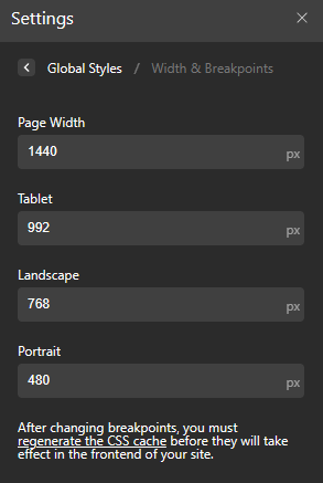
| Note that I only changed the first breakpoint |
| The other breakpoints on this screenshot are at those values in Oxygen by default. Also, notice that they use different terminology and call the 768px a "landscape". You can change the values of the 4 breakpoints, but not their names. |
| In this guide, I will only finalize the main 1440px design |
| The guide is going to become too long otherwise. Documenting all the tablet and mobile adjustments would just make it excessive and include a ton of unnecessary repetition. |
If you're a web developer that does responsive designs, the information in this guide should be sufficient to help you easily know what to do to finish the mobile and tablet breakpoints.
It's just a process where you select "mobile" or "tablet" in the breakpoint selector and enter different values for all the properties that differ from desktop.
Getting started, setting up the structure
If you create websites using raw HTML and CSS, the very first step in your workflow is probably to set up your overall structure. Ideally using semantic markup.
We can follow the same workflow in Oxygen; We'll just add the sections and elements that represent the base structure of the page and its markup.
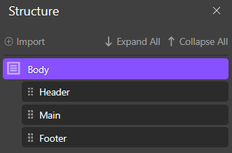
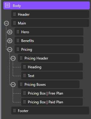
To do this, I went ahead and added an Oxygen "section" element for each of the main parts of the website. Namely the header, the main and the footer.
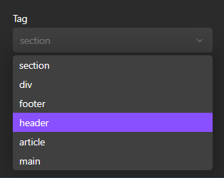
Note that in Oxygen there isn't a separate "footer" element or a "header" element. You utilize a so-called "section" element and choose the semantic tag from the section settings, like so:
And with that, we get this preview in the structure panel:
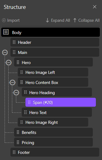
Next, we add the Hero and the content of the Hero, to get a structure that looks like this:
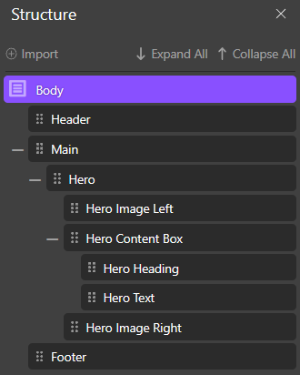
I have to admit this is a bit nicer to look at than an HTML file. You get a really good visual representation of the markup structure.
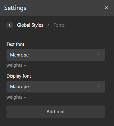
Before we proceed, let's get the Google fonts into the project here
This part is easy with Oxygen. It supports all Google fonts out of the box. You just have to start typing the name of the Google font, and it will appear as an option. When you choose it, I guess Oxygen takes care of all the rest.
In this particular design, we use the same font (Manrope) for everything, so I set it under both options under global settings, like so:
And while we're at it, why not set the body color as given in the Figma design
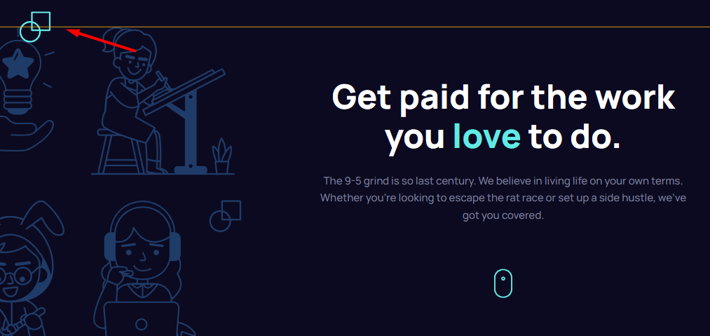
Let's handle the Hero section first
Obviously, the Hero won't look any good at this stage. This is for two reasons. The background color, as well as the layout. We'll fix both right now.
How do you change the body background color in Oxygen though?
Initially I couldn't find a panel or option to set values on the body of the page, so I assumed you have to go into the custom CSS panel and just do this
body {
    background: #080C20;
}
Fortunately, there is a way to select and style the body in Oxygen. You just go to the "Selectors" panel, click "Add Selector" and type in "body".
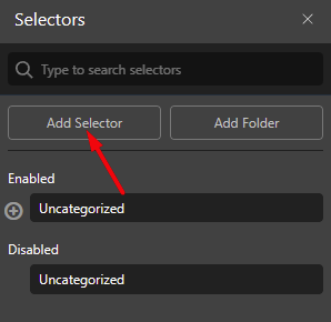
Once you do this, body appears in your Selectors list where you can select it. And with that, we can set the background color like so:
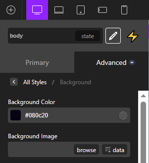
And the Hero is starting to look just a bit less weird
A thank you to Alexander Buzmakov from the FB group for showing me the body-selection method.
Next, we can proceed to handle the Hero Layout
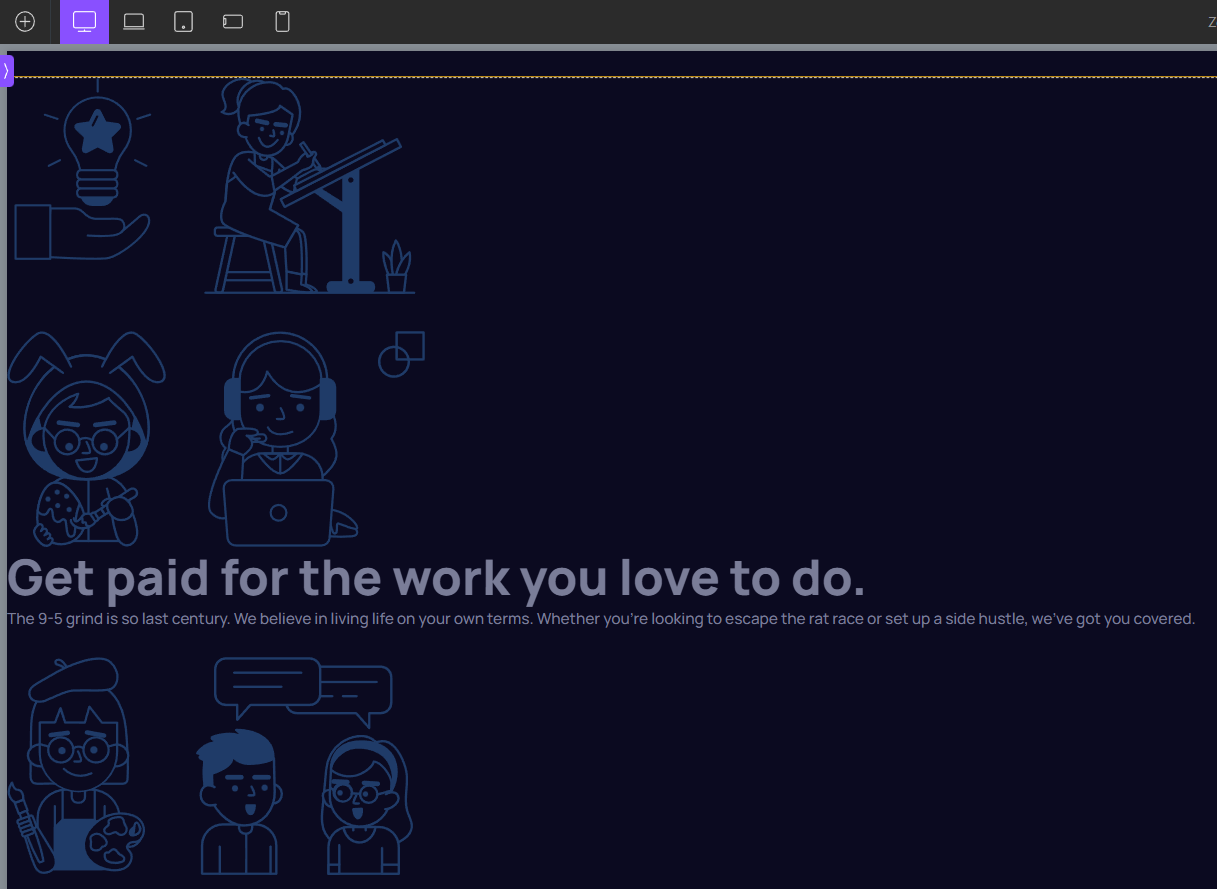
This layout is pretty tricky. And I don't mean that it is tricky to do in Oxygen. This is a tricky layout whatever tool you use to recreate the design. It is meant to be challenging and unintuitive on purpose. Once you know the solution, however, it is pretty straightforward.
The tricky part is that you have these two images and they are supposed to get cut off at the edges of the screen. At least when viewed on a screen around the 1440px breakpoint.
The solution involves knowing what flex properties to use, as well as setting a "hidden" overflow on the section as a whole.
Doing all of this in Oxygen was surprisingly straightforward. Oxygen gives access to all the necessary settings in 1 or 2 clicks.
I do remember how much I struggled when I first produced this kind of split-hero layout in CSS. Now that I understand the logic, recreating it in Oxygen was quite fast.
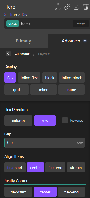
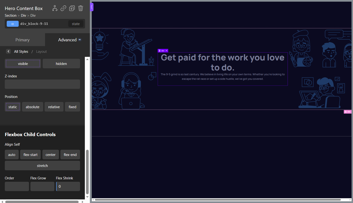
First, we can set up the Flexbox settings
Fortunately, all of the flex properties we need are available in the panel, under Advanced > Layout.
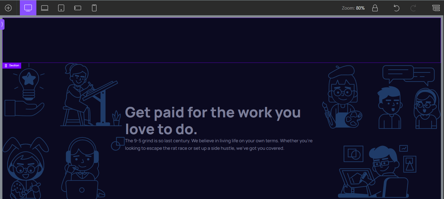
With that, the design is getting a bit closer to what we need...
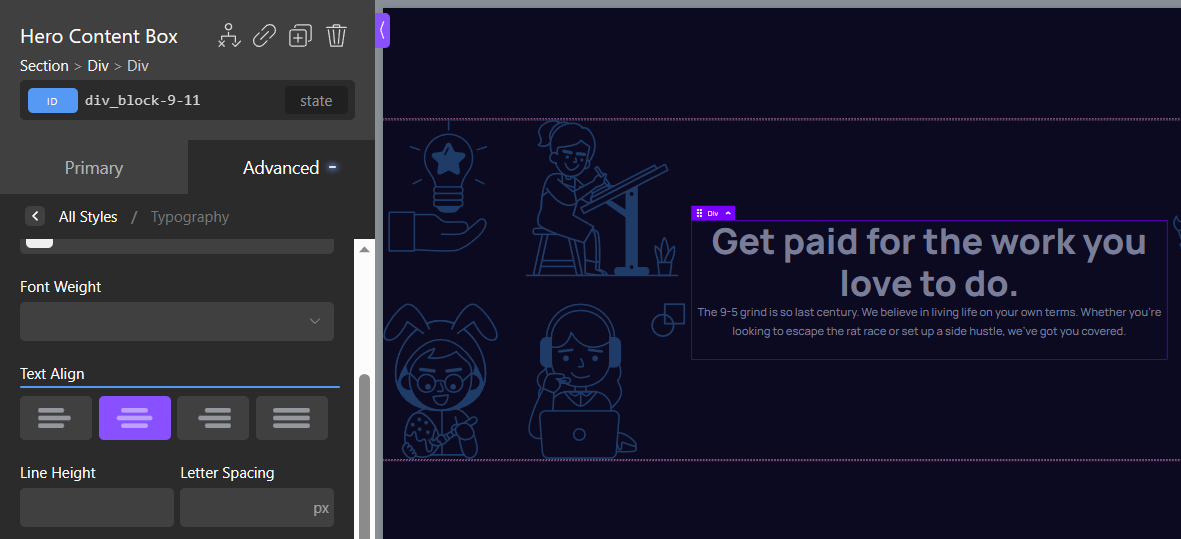
The text is off because it isn't centered. We can choose the content-box element and choose the text-align: center option like so:
Now, how do we get those two side images to "leak" off-screen?
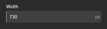
The trick is to make sure that the 3 elements (combined) are larger than the screen, and they cannot fit. In this particular design, this is easy and will involve just setting the content box to a width of 730px. Why this number? It is what the Figma design uses for the content box in question and it happens to work for our purpose here.
Since the images have their own fixed width, the combined width will be bigger than the screen size at the breakpoint that we're working with here (1440px).
Unfortunately, if you try this, nothing happens, and you won't see a change on the screen. You might wonder why nothing is happening even though you did set a width explicitly.
This isn't an Oxygen thing, this is a Flexbox thing. Flexbox automatically shrinks any elements (if allowed) to make sure that everything fits in the container (or screen in this case).
So we have to set the flex-shrink property of the content box to a value of 0. Fortunately, this setting is available right there in Oxygen as well. It's on the bottom of the same panel we used to set up the Flexbox settings. It is under the section called "Flexbox Child Controls".
And with that, we manage to push the images off-screen.
However, this introduces scroll bars, and you will also get scroll bars if you open the site in a browser. The solution is simple: setting the parent's overflow to hidden.
Fortunately, even the overflow control is right there in the same panel:
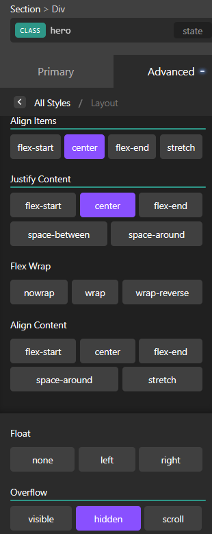
Again, we need the hidden-overflow setting so that the left and right images go off-screen, without also causing the browser to add a horizontal scrolling bar.
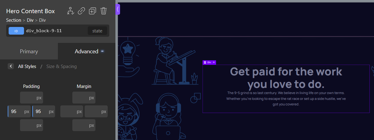
And finally, let's get the spacing to match Figma exactly
Let's first add padding on the content box
And then add a bottom margin on the heading
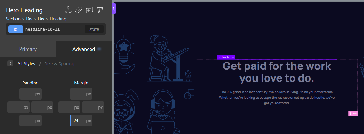
Matches Figma exactly
Dilemma: How do you set values for classes of styles?
In this context when I say "classes" I don't mean a CSS class, but I mean the more general idea of a "class of things". If I want certain elements in CSS to have a given color and font size I might assign them all a CSS class. And then I can set the color on that class which will render all those elements with that color.
Whilst Oxygen supports CSS classes, I was wondering what would be the best practice in recreating certain aspects of typography and color control in the Oxygen context.
For example, all 3 heading sizes in the Figma file share the same color and font weight. So, when I originally completed this challenge in raw CSS I wrote this code to keep it all in one spot.
h1, h2, h3 {
    color: white;
    font-weight: 800;
}
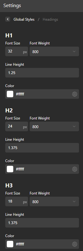
In Oxygen, you can go to global settings > headings and set the colors, font sizes and other properties on a global level.
There is just one problem. Per the Figma design, the font sizes and line heights are different at different breakpoints. However, setting a value on the "global level" in Oxygen applies across all breakpoints.
So I decided to solve this by adopting the following "mental modal"
I realized that setting values in the Oxygen global settings is equivalent to setting some values at the top level in a CSS stylesheet. And by this, I mean the values which you set outside of a media query.
Since most people follow a mobile-first approach, I decided to set the global values to match the Figma design for mobile devices, like so:
A note on REMs and Typography:
If you think using REMs is important, please don't freak out - to keep it simple I'm setting typography using the Figma-provided pixel values, but will convert these to REMs at the very end.
We'll achieve this using a cool trick (credit to Josh Comeau). This trick allows us to avoid the 62.5% hack used by most. And as a bonus, you will learn how CSS variables are used in Oxygen.
As for variations on the other breakpoints, I decided to resort to Oxygen classes
The CSS version of the design had these values set on the 768px breakpoint.
@media screen and (min-width: 768px) {
    h1 {
        font-size: 32px;
        line-height: 40px;
    }

    h2 {
        font-size: 24px;
        line-height: 33px;
    }

    h3 {
        font-size: 18px;
        line-height: 25px;
    }
To reproduce this kind of "per-breakpoint" control of values, I decided to utilize Oxygen's classes system and set a "Heading1" class on the h1 element inside of the Hero. Then, choose the appropriate breakpoint, and then set the values from the panel, like so:
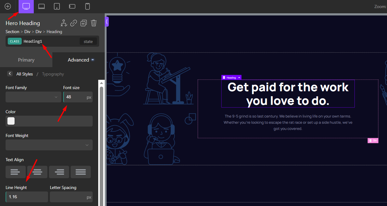
This is equivalent to writing the following CSS code:
@media screen and (min-width: 1440px) {
    h1 {
        font-size: 48px;
        line-height: 56px;
    }
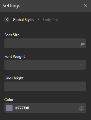
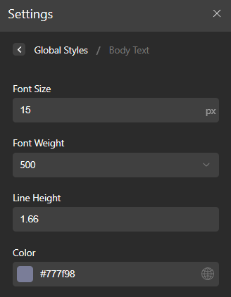
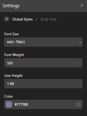
We can then do the same for the body text
So to achieve the equivalent of this CSS code:
body {
    color: #777F98;
    font-weight: 500;
    font-size: 15px;
    line-height: 25px;
}
You can set the following values in Oxygen:
The hero section is almost done
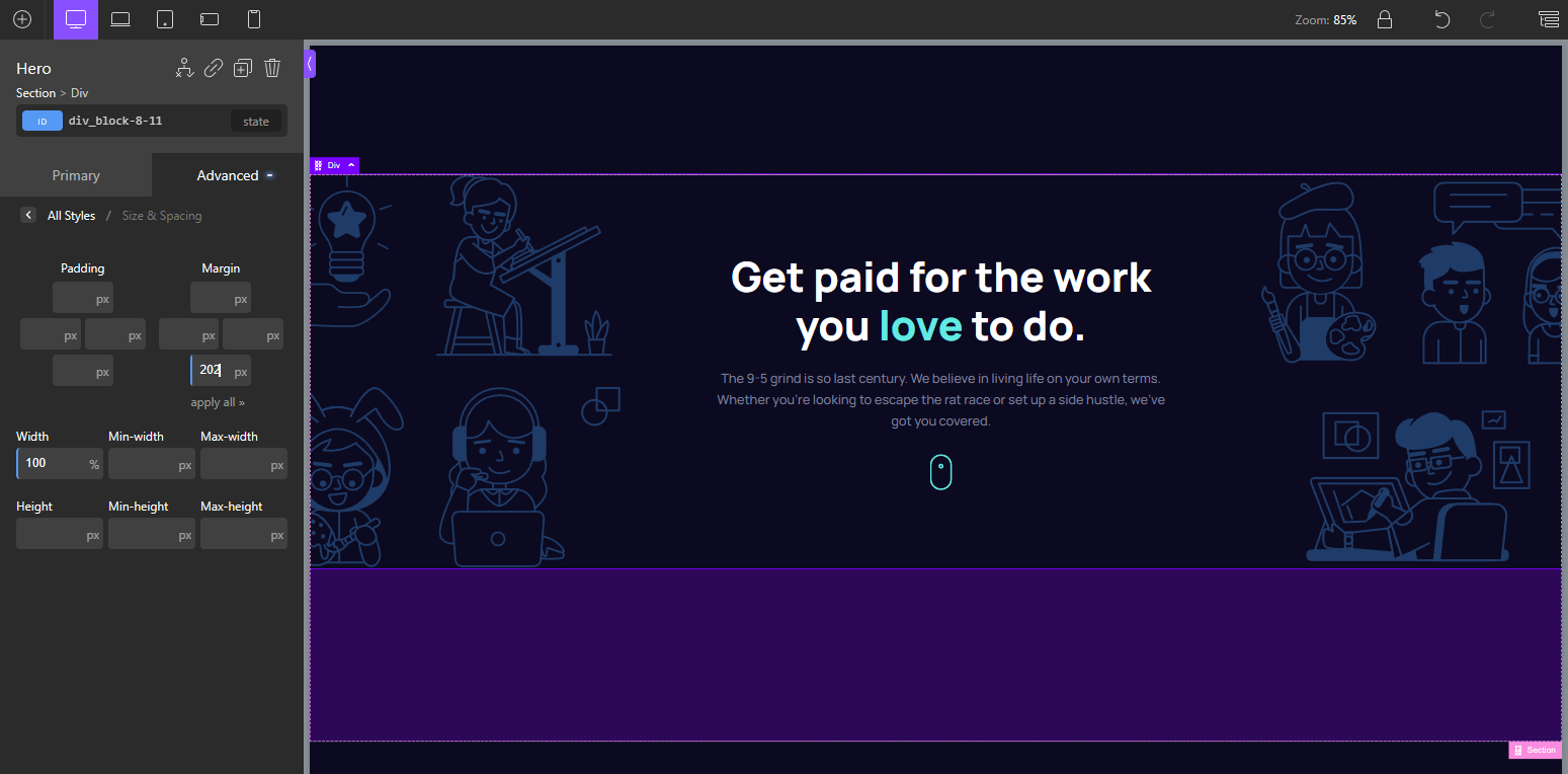
With the work up until this point, we see the following result:

There are now two things left to do so that the Hero section here in Oxygen looks identical to the Figma design. The word "love" needs to be a different color, and we also need the scroll icon.
Creating the "love" span
If you wanted to handle the green-colored "love", in CSS, you would use a <span> tag. The Oxygen approach also involves using a Span, however not written in code, but rather as an Oxygen span element.
To create a span Element in Oxygen, you select the text you want to convert into a span, then click the span button in the toolbar:
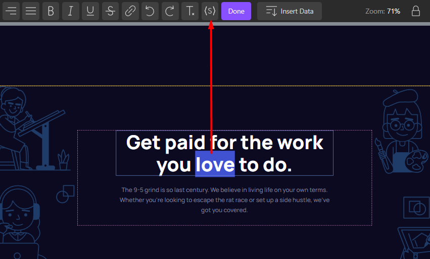
It then appears in the Oxygen structure as an element:
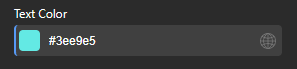
With the span element selected, we can just go and set its color to match the Figma design like so:
As for adding the scroll icon, I just added an image element to end up with this structure:
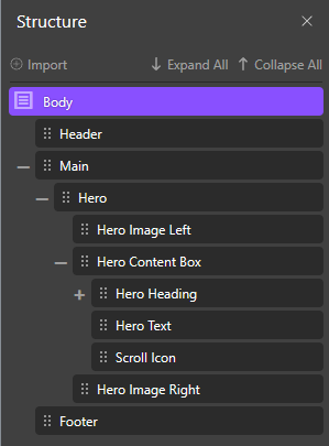
And so with that, we now have a pixel-perfect recreation of the Hero section that matches the Figma-provided design:
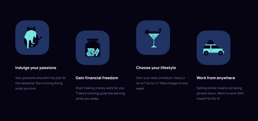
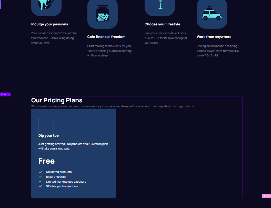
Moving on to the "Benefits" Area
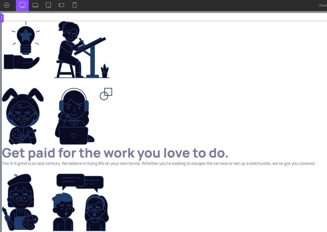
When I'm talking about "the benefits area", I am referring to the area that follows the Hero section. Here's a screenshot from the Figma file for reference.
First things first, we have to create breathing space after the hero, so we'll just add a margin-bottom on the hero as per the Figma design:
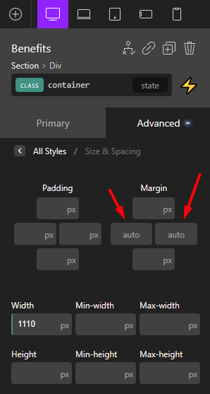
Next, let's add a container div for the "benefits content box"
In CSS you might be familiar with the technique of setting up a class called .container and then giving this class a fixed width and a margin: 0 auto. Well, it seems you can do just the same in Oxygen, and it's rather convenient and easy to do so.
Next, let's create just one benefit box
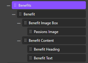
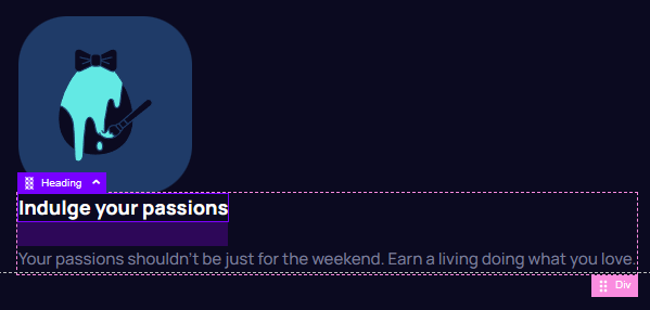
I think the workflow will be a lot faster if we create just one benefit, style it, and then duplicate it to get the 4 in the design. To start I create the markup for this Benefit.
I'm doing the Oxygen equivalent of the following code:
    <div class="benefit">
        <div class="benefit-image-box"><img src="./assets/illustration-passions.svg" alt=""></div>
        <div class="benefit-content">
            <h3 class="benefit-heading">Indulge your passions</h3>
            <p>Your passions shouldn't be just for the weekend. Earn a living doing what you love.</p>
        </div>
    </div>
If you did things right, the Oxygen panel should show this structure:
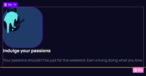
And in the visual editor, you should see this:

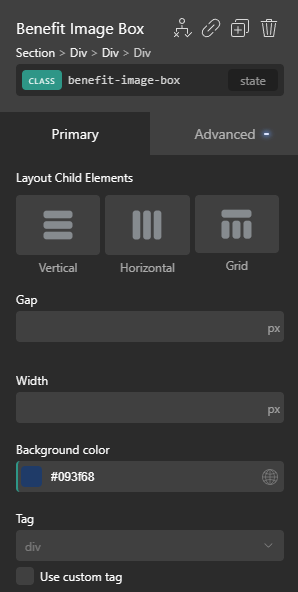
Let's now style the image box to match the Figma
We can use the .benefit-image-box class to assign the necessary background. Just make sure the class is selected in Oxygen or you might apply it to the wrong selector.
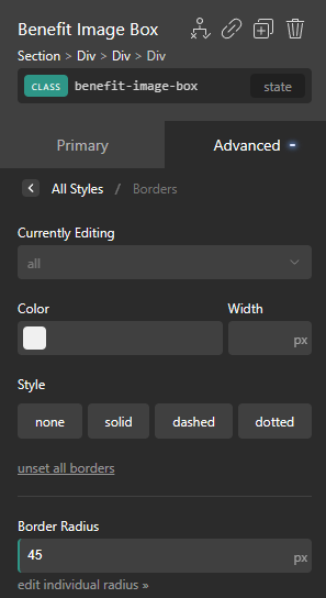
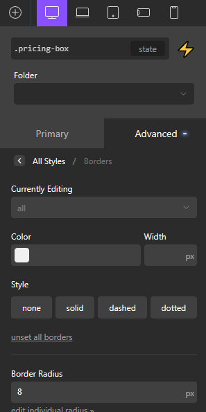
Next, we can set the border radius in the dedicated "Borders" panel
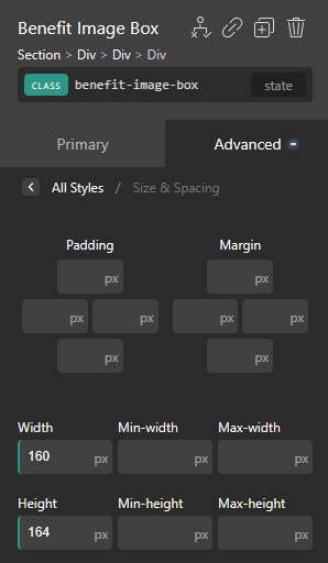
We can also set sizing in the "Size & Spacing" panel.
And if you've done everything right up to this point, the benefit will look like this:
Let's just center the image using Flexbox
Looking at the result, I think it's a good time to handle the spacing

However, I have no idea how to do a global reset in Oxygen. ChatGPT again wasn't helpful.
In this case, I want to set the margin-bottom to fit the Figma exactly, but we're getting margin-collapsing issues because the paragraph has a margin-top by default.
So I again went with resorting to the custom CSS option, because I have no idea how and if it a margin reset be done from the interface.
So my custom stylesheet now looks like this
* {
    margin: 0;
}


body {
    background: #080C20;
}
And with that, we can now set the margin on the heading itself, to make it easier to Match the Figma exactly:
As for getting a gap between the image box and the heading, I prefer getting that done with a flex gap instead of margins
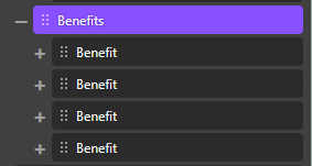
Next, let's get multiple benefits in there
We can just duplicate the first benefit like so:
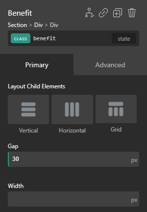
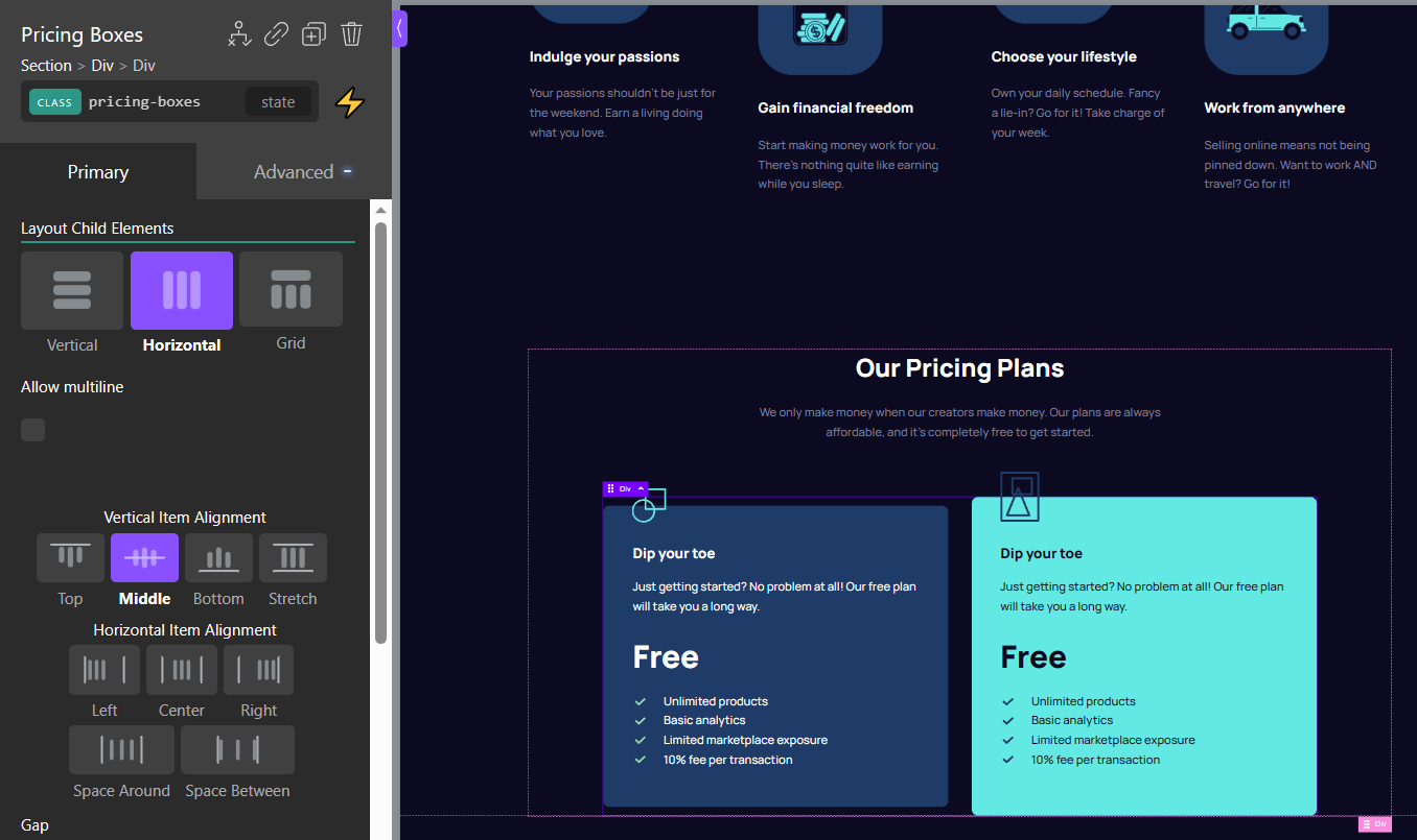
Next, we can set the flex options on the benefits div like so:
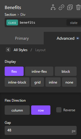
And with that we should be getting quite a bit closer to the final look

Time to achieve the tricky "zig-zag" effect
When I completed this challenge with raw CSS, I had achieved this effect by using nth-child():
    .benefits .benefit:nth-child(odd) {
        align-self: flex-start;
    }

    .benefits .benefit:nth-child(even) {
        align-self: flex-end;
    }
In the Oxygen version, we can do it by going to every other benefit and setting it manually. I don't think this is too much of an issue, as there are only 2 elements of each type, so abstraction isn't really necessary. It's not like we're going to have hundreds of these elements on the page.
Before we do that, however, we need to make sure there is space for the benefits to move up and down in the container. Otherwise setting individual items to flex-start or flex-end will do nothing.
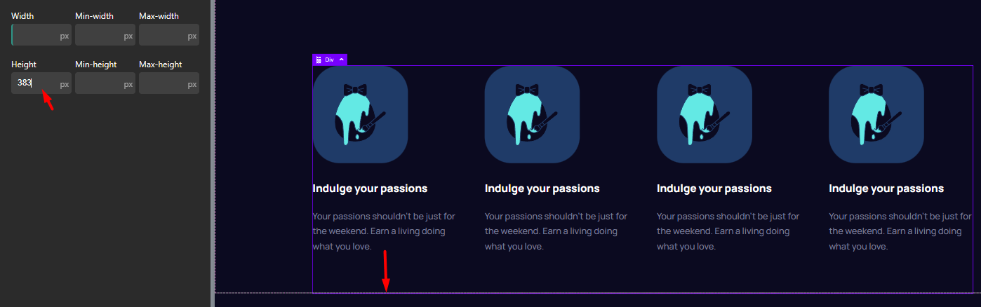
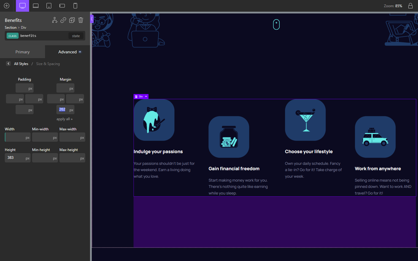
So we can just set a height of 383px on the parent element (as per Figma design). This creates the space for the 2nd and 4th benefit elements to move down with the use of flex-end.
Let's select the second benefit and give it the class "benefit-even". And then, having selected this class, we can set a flex-end value.
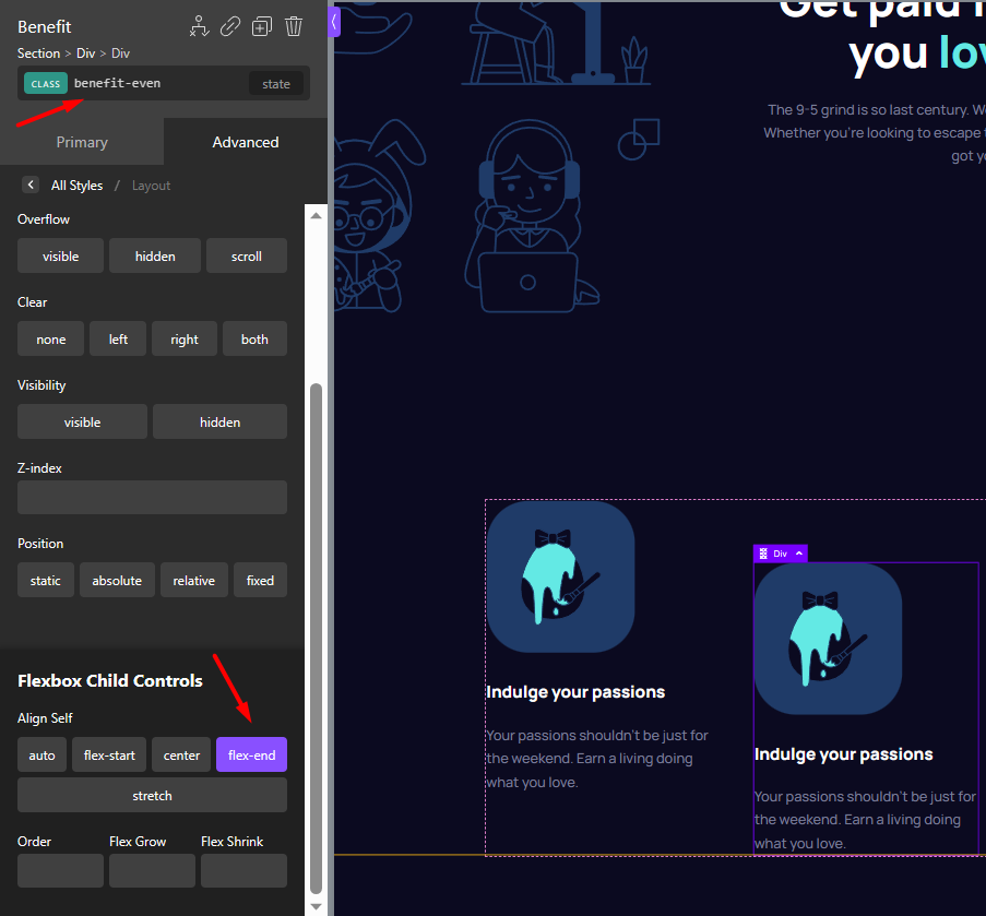
To apply the same effect to the 4th benefit, we don't need to choose that element and set flex-end. That would apply the value to its unique ID which is unncessary code duplication.
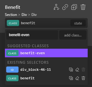
We just need to choose the 4th element and assign the same class we used on the second element. Select the 4th element, and choose the .benefit-even class from the class picker.
And with that, the benefits area is done
Or is it? One small fix before continuing further
You'll notice that the spacing between the hero text and the scroll icon is now gone This happened to us because we reset the margins a bit earlier.
The fix is quite easy, just add the Figma-provided margin value on that element:
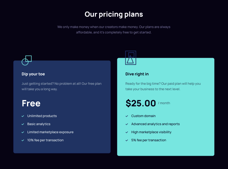
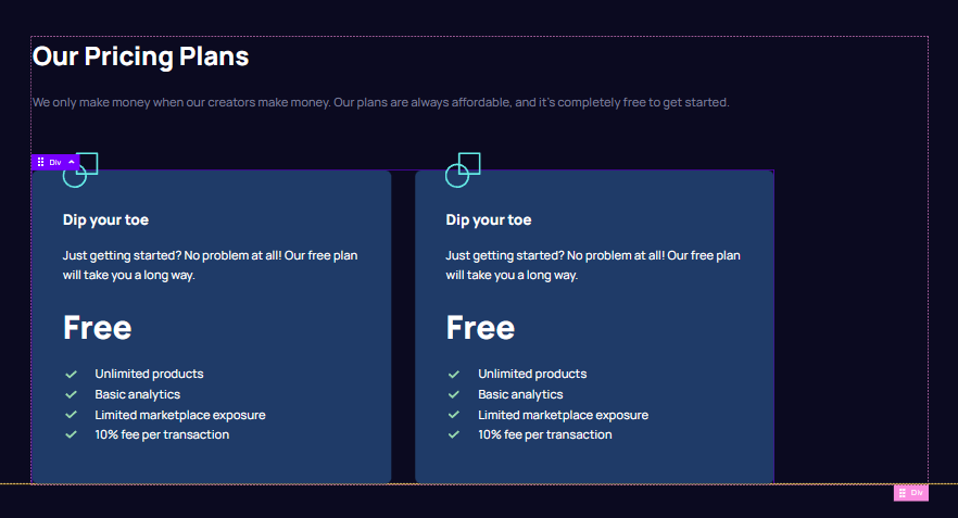
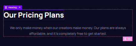
Moving on to the "Pricing" Area
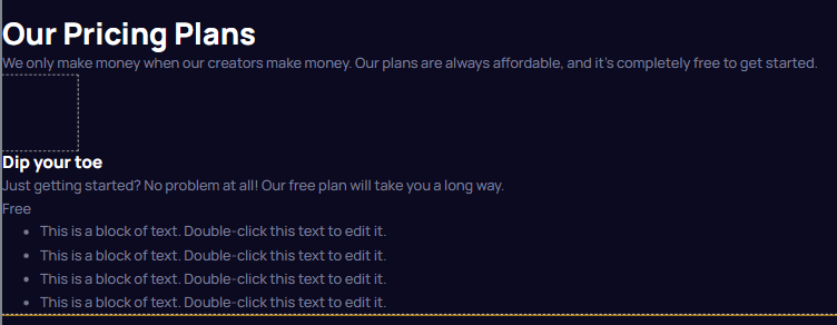
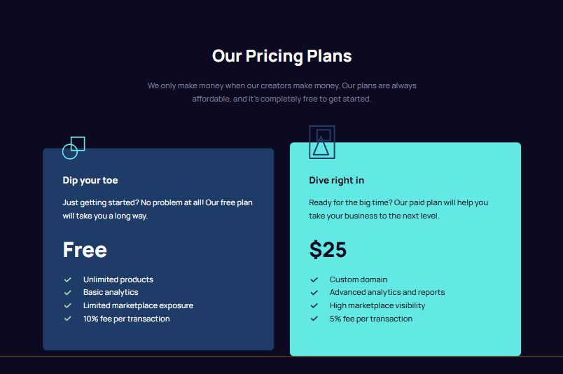
For reference, this is how the pricing area looks like in the Figma file:
First things first, we have to create breathing space after the hero, so we'll just add a margin-bottom value on the hero as per the Figma design:
Next, let's add the pricing-area structure and try out Oxygen's brand-new Emmet feature
As I was writing this article, I learned that Oxygen has this brand new and exciting workflow-boosting feature, which allows you to use Emmet to add new markup.
You can even use this feature to write super-long Emmet commands where you create super complex and deeply nested markup structures and even define all of the content that should be inside of the elements.
I am however going to keep it simple for now and won't try to do the entire pricing structure with a single Emmet command.
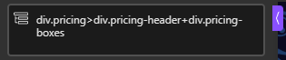
Let's just create the .pricing div, and the two children divs inside of it. That includes the .pricing-header and .pricing-boxes.
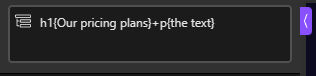
Next, we can select the pricing header and use Emmet to create the markup inside. Note that you specify the inner content in between the curly braces...
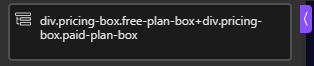
Next, we can choose the "pricing boxes" element, and again using Emmet create the two divs inside like so:
And with all of this Emmet magic, we have now created the basic structure and markup for the pricing area. And we did it all by just typing a few commands.
I can see how this feature can speed up a workflow if you get comfortable using Emmet. In my case it wasn't faster than creating the structure using the standard way, but that's because I had to think about how to do it with Emmet.
I can imagine how if you get comfortable with it, you can write super-complex markup in seconds instead of minutes. So if you make a lot of sites with Oxygen, it might be worth getting used to it.
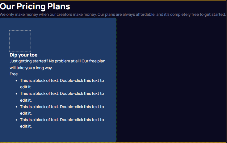
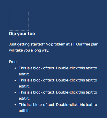
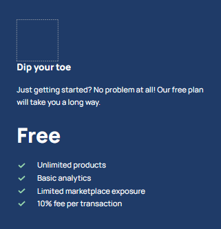
Now, let's do the inner markup of the pricing boxes themselves (this one has a tricky bit)
It's probably best to create the inner structure and markup for the left box first, and then duplicate it. This is going to save us quite some time.
When I did this challenge using a regular HTML implementation, I created it like this:
<div class="pricing-box free-plan-box">
<div class="pricing-icon"></div>
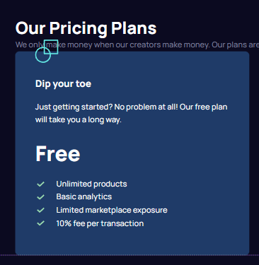
<h3>Dip your toe</h3>
<p class="pricing-box-description">Just getting started? No problem at all! Our free plan will take you a long way.</p>
<div class="pricing-box-price-tag"><p>Free</p></div>
<ul>
<li>Unlimited products</li>
<li>Basic analytics</li>
<li>Limited marketplace exposure</li>
<li>10% fee per transaction</li>
</ul>
</div>
Reproducing the divs and the heading in Oxygen is going to be straightforward, and can be done like we've done everything else up until this point. You just select the .free-plan-box div and start adding Oxygen elements inside of it.
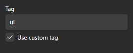
However, there is a gotcha in terms of the unordered list. Oxygen has no list element. And apparently, there are two ways to create a semantically correct unordered list in Oxygen:
Add a rich-text element, and use the WYSIWYG editor to create a list
Add a div element, and set its custom tag as <ul>;
- then add divs inside of it, setting those to a custom tag of <li>
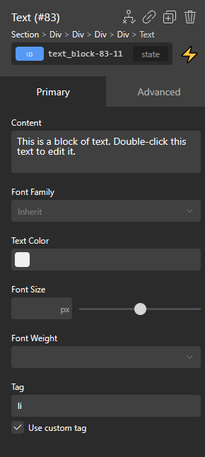
I went with the second option. Created a div, and gave it a custom tag like so:
And then created a text element inside, set it to <li>, like so:
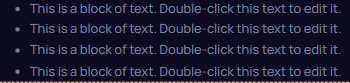
If we click the duplicate button 3 times, we get this on the page:
Now let's quickly work on the rest of the markup and get the entire free-plan pricing box reproduced as Oxygen elements. Again, remember that the HTML for the free-plan pricing box looks like this:
     <div class="pricing-box free-plan-box">
       <div class="pricing-icon"></div>
       <h3>Dip your toe</h3>
       <p class="pricing-box-description">Just getting started? No problem at all! Our free plan will take you a long way.</p>
       <div class="pricing-box-price-tag"><p>Free</p></div>
          <ul>
              <li>Unlimited products</li>
              <li>Basic analytics</li>
              <li>Limited marketplace exposure</li>
              <li>10% fee per transaction</li>
            </ul>
    </div>
If we add all the elements inside of Oxygen to match, at this point, we should get something like this in the builder:
*Note that I deleted the paid-plan box we created earlier, just to keep things tidy. We'll duplicate the free-plan box once we're done with it.
**The empty square div is the one intended for the icon. It's not a best practice how I have it here, but we'll discuss that later.
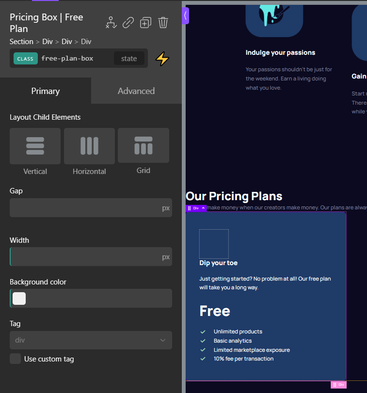
Time to style the pricing box
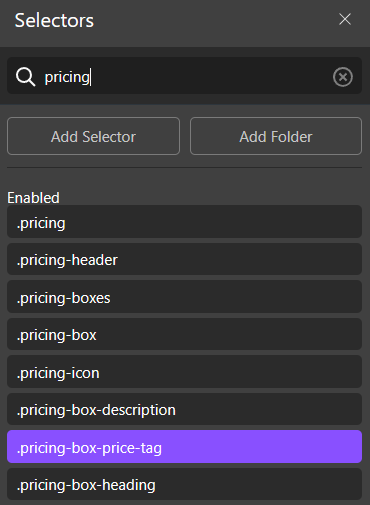
Oxygen has a convenient way of managing and finding classes with a specialized "selectors" panel. This means you do not have to remember which element uses a class, select the element, and then finally select the class.
You can select classes directly and style them that way, regardless of what element they are being used on. This makes the Oxygen workflow a lot closer to how you work in raw HTML and CSS.
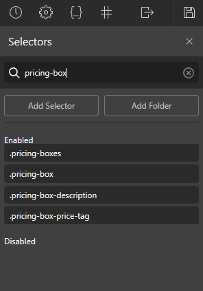
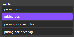
So we can go ahead and look for the .pricing-box class in the "selectors" panel:
When I did this challenge originally in raw HTML and CSS, I had coded the following CSS for the tablet and desktop version:
    .pricing-box {
        width: 445px;
        background: #093F68;
        border-radius: 8px;
        color: #FFFFFF;
        padding: 49px 38px;
        position: relative;
    }
We can reproduce the same in Oxygen. Let's just choose the class we need.
Then we can just go ahead and style it (reproducing the raw CSS version) using the panel on the left, as follows:
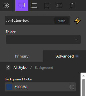
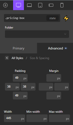
*As a reminder, if you're wondering where these values are coming from, and why those values in particular, this is all coming from the Figma we have been provided.
With all of that done, we're slowly starting to get closer to the desired result...
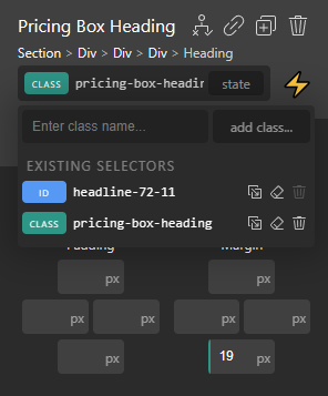
At this point, I think it's good to handle the spacing for the pricing box header and pricing box description. To do this I realized it's probably a good idea to add a class called .pricing-box-header to tackle styling that header.
This is something I failed to do when I was doing this challenge in raw CSS. Back then I just got lazy and simply used a compound selector like so:
    .pricing-box h3 {
        margin-bottom: 19px;
    }
In Oxygen, the only way to use compound selectors is to write custom CSS. If you're going to try and do everything through the UI, you will be "forced" to use classes instead.
So in that sense Oxygen kind of directs you to adopt best practices. This is unlike regular CSS where it is easy to get lazy and say "I can't be bothered coming up with another class, I'll just do a compound selector".
So let's just continue and this new .pricing-box-heading class and set the margin-bottom on that class like so:
If you followed the previous steps, you should have a .pricing-box-description, and we can use that to set the necessary margin-bottom of 24px as well.
Now, let's get those svg bullet points in there
The Figma design has the bullet points as green checkmarks, and FrontendMentor provides us with SVGs as assets.
This was my solution on the CSS side of things
.pricing-box ul {
    list-style: none;
}

.pricing-box ul > li::before {
    content: "";
    height: 1em;
    width: 1em;
    display: block;
    float: left;
    margin-left: -2.5em;
    margin-top: 5px;
    margin-right: 3px;
    background-position: center;
    background-repeat: no-repeat;
    background-size: 100%;
    transition: background-size 0.3s;
    -webkit-transition: background-size 0.3s;
}

.pricing-box ul > li::before {
    background-image: url(".assets/icon-check.svg");
}

.free-plan-box ul > li::before {
    filter: invert() hue-rotate(90deg);
}
You might be wondering why have a filter on here. The SVGs provided by FrontEndMentor are blue, the same as the background color for the free-pricing-plan box.
So I decided to just use a filter to get the right color for the checkmarks on the free-plan box, rather than uploading another identical svg with a different color.
As for reproducing this styling in Oxygen, I won't even try to do it through the UI. Seeing that Oxygen doesn't have a list element, I think it's safe to say list styling is a good candidate as an exception where you do things with custom CSS.
In addition, whilst the Oxygen UI does support pseudo-elements like before and after, most Oxygen experts will tell you they skip the UI and just go straight for the custom CSS, as pseudo-elements can get pretty complex and it doesn't make sense to do it from the UI.
Also, note that there is a gotcha if you're going to use this CSS to style the icons as SVGs inside Oxygen.
Since we're adding the images through the CSS, we'll need to host that SVG somewhere. The easiest thing to do is go to the WordPress media library, upload the SVG, and copy the URL path from there.
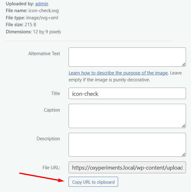
And then use it in the CSS as you would an external image
.pricing-box ul > li::before {
    background-image: url("https://oxyperiments.local/wp-content/uploads/2023/04/icon-check.svg");
}
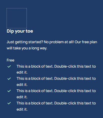
And with that, we will get our styled bullet points
While we're on the topic of getting close to the final design, let's get the actual bullet-point text in there and style the pricing tag as well.
To do that, the most convenient way is just choosing the class from the "Selectors" panel
Then simply reproduce the following CSS values in Oxygen
    .pricing-box-price-tag {
        font-weight: 800;
        font-size: 40px;
        line-height: 55px;
        margin-bottom: 19px;
    }
And with that, we're almost there
Let's just add that icon that sticks on top of the box
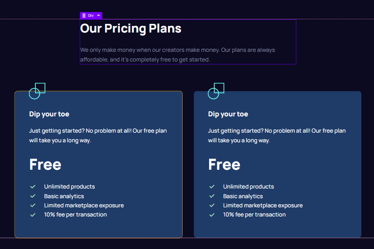
Before we do that though, I'd like to handle the overall pricing container div, as currently it is sticking to the left side of the screen and it is hard to focus on the design of the pricing box.
The fix is simple. We just need to apply the container class to the .pricing div, like so:
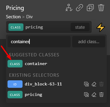
Problem fixed
With that said, let's do the icon. The solution is very similar to the bullet points. We will be using the ::before pseudo-element and an SVG uploaded in the WordPress media library.
    .pricing-icon::before {
        content: "";

        background-repeat: no-repeat; /* Prevent the image from repeating */
        display: block; /* Display the pseudo-element as a block element */
        position: absolute;
    }

    .paid-plan-box .pricing-icon::before {
        background-image: url("./assets/icon-paid.svg"); /* Set the background image */
        background-size: 51px 65px; /* Set the size of the image */
        top: -33px;
        left: 37px; /* Center the icon horizontally */
        width: 51px; /* Set the width of the pseudo-element */
        height: 65px; /* Set the height of the pseudo-element */
    }

    .free-plan-box .pricing-icon::before {
        background-image: url("https://oxyperiments.local/wp-content/uploads/2023/04/icon-free.svg"); /* Set the background image */
        background-size: 45px 45px; /* Set the size of the image */
        top: -22px;
        left: 37px; /* Center the icon horizontally */
        width: 45px; /* Set the width of the pseudo-element */
        height: 45px; /* Set the height of the pseudo-element */
    }
However, if we do this, you'll notice the icon appears on top of the page, not on top of the pricing box.
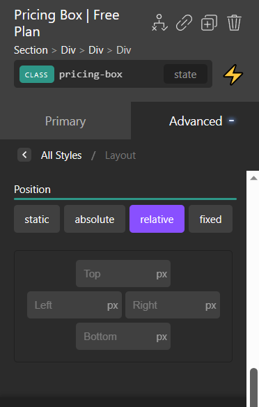
This is because we need to set the .pricing-box class to relative
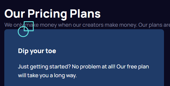
And with that, we run into our first Oxygen-related problem
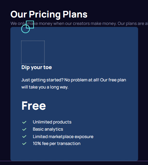
You will see that Oxygen displays this empty box even though it has zero width and height. This is for UX reasons. Oxygen wants every element to be viewable and selectable in the UI so it will always set them to be at least 80px in width or height.
It only does this in the editor though, so this isn't a problem on the front end where the div isn't taking up any space
With that said, the fact that I solved this part of the challenge by using an empty div was probably not a "best practice". So again, Oxygen is kind of forcing me into doing things correctly. Fortunately, the solution is simple, just move the pseudo-elements to the pricing box itself, like so:
    .pricing-box::before {
        content: "";

        background-repeat: no-repeat; /* Prevent the image from repeating */
        display: block; /* Display the pseudo-element as a block element */
        position: absolute;
    }

    .paid-plan-box::before {
        background-image: url("./assets/icon-paid.svg"); /* Set the background image */
        background-size: 51px 65px; /* Set the size of the image */
        top: -33px;
        left: 37px; /* Center the icon horizontally */
        width: 51px; /* Set the width of the pseudo-element */
        height: 65px; /* Set the height of the pseudo-element */
    }

    .free-plan-box::before {
        background-image: url("https://oxyperiments.local/wp-content/uploads/2023/04/icon-free.svg"); /* Set the background image */
        background-size: 45px 45px; /* Set the size of the image */
        top: -22px;
        left: 37px; /* Center the icon horizontally */
        width: 45px; /* Set the width of the pseudo-element */
        height: 45px; /* Set the height of the pseudo-element */
    }
And we can now delete the empty div that I never even needed to have in the first place
With that said, let's handle the spacing above the pricing box as well
We can now set the margin-bottom of the .pricing-header to 72px as per the Figma design. We can also set the margin-bottom of the h2 heading to 24px, again, matching the Figma design.
And while we're here why not set the typography of the H2 to match the Figma file... In a CSS implementation, we might do the following
@media screen and (min-width:1440px) {
    h2 {
        font-size: 32px;
        line-height: 44px;
    }
}
However, Oxygen doesn't have an 'h2' selector. We can achieve the same by giving the h2 element a class called .pricing-header-heading and give it the same values using the Oxygen panel.
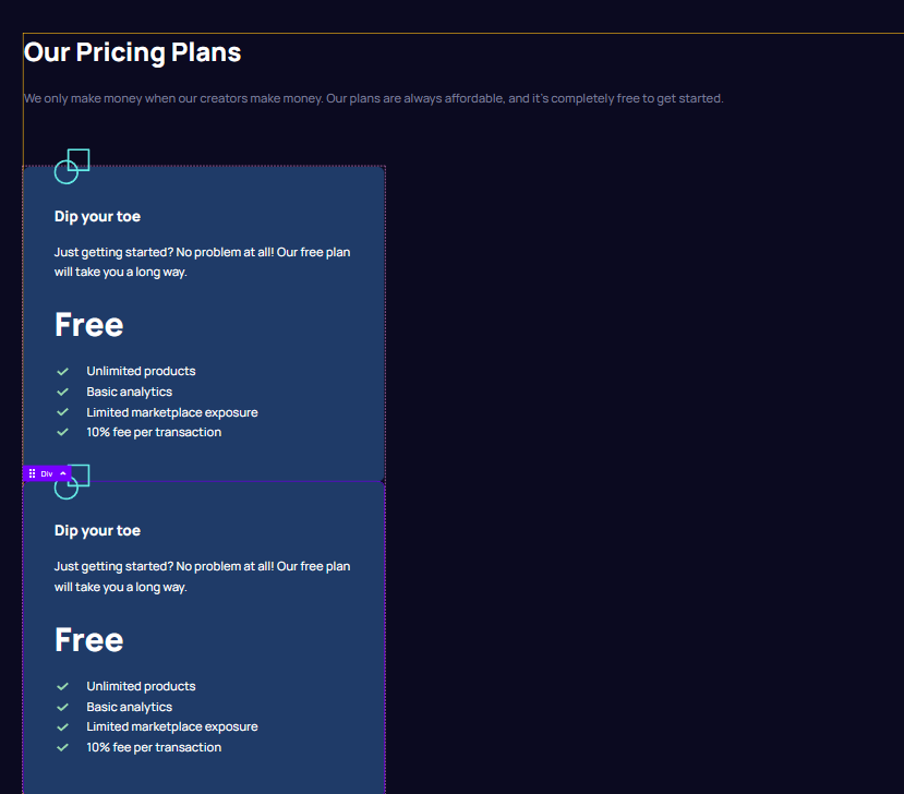
Let's now add the paid-plan box
First, duplicate the free-plan box
We need to set these as flex items. Fortunately, Oxygen has this cool thing where they put the most used properties on the "primary" panel. So you often don't even need to go to the dedicated "Layout" panel which contains all of the different flexbox properties and options.
The "Primary" panel is the default option set that appears whenever you select an element. In our use case here, all the properties we need are right there.
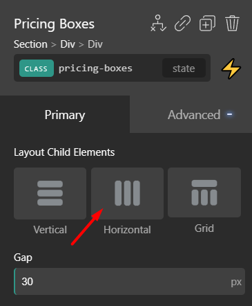
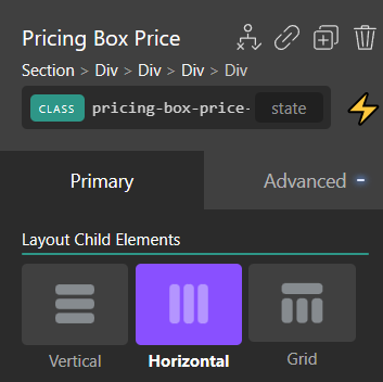
Just set the gap to 30, and the layout to "Horizontal". This is the equivalent of writing the following CSS:
    .pricing-boxes {
        display: flex;
        gap: 30px;
        flex-direction: row;
    }
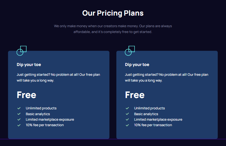
And with that done, you might be noticing the next thing that we need to fix and implement. Let's take a quick look at the result.
Do you notice any layout issues compared to the reference design?
Let's fix the pricing layout
We need to turn the .pricing div into a flex as well. And we can do that by just clicking vertical and then center.
This is the equivalent of coding the following CSS:
.pricing {
    display: flex;
    flex-direction: column;
    align-items: center;
}
And finally, to match the Figma exactly, we'll want to give the .pricing-header a fixed width of 573px on the desktop
And next, we just need to center the text. However, there is a gotcha here. Whereas in the raw HTML implementation, we could simply set a text-align: center on the .pricing-header, this isn't working to center the heading here...
If we select the heading, we can see why.
It seems that, unlike in HTML where by default headings stretch to 100% of the width of the parent due to being block elements, this isn't the case here. I'm guessing it's an Oxygen thing. We can just set the width to 100% and we're good to go
Now, let's finalize the paid plan styling
Let's get hose paid-plan colors from the Figma file into Oxygen. This is the CSS that we need to convert into Oxygen properties.
    .paid-plan-box {
        background: #3EE9E5;
    }

    .paid-plan-box, .paid-plan-box h3 {
        color: #080C20;
    }
As we've gone through how to do this a few times, I won't be documenting how to do it and you should be able to easily do it on your own.
I'll just give you a hint that in Oxygen it's probably best to go for classes instead of compound selectors to achieve similar results.
If you do all of that, and also replace the icon asset, you should get the following results inside of your editor:
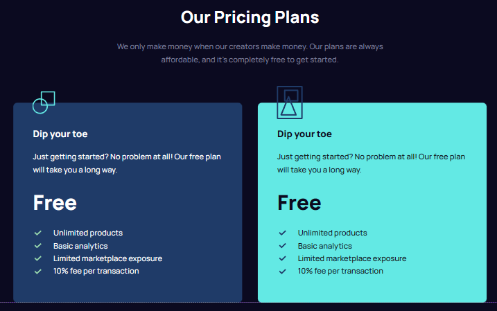
Just one major thing left. This box for the paid plan needs to be bigger. The way I achieved this is to just use different padding on the .paid-plan-box class
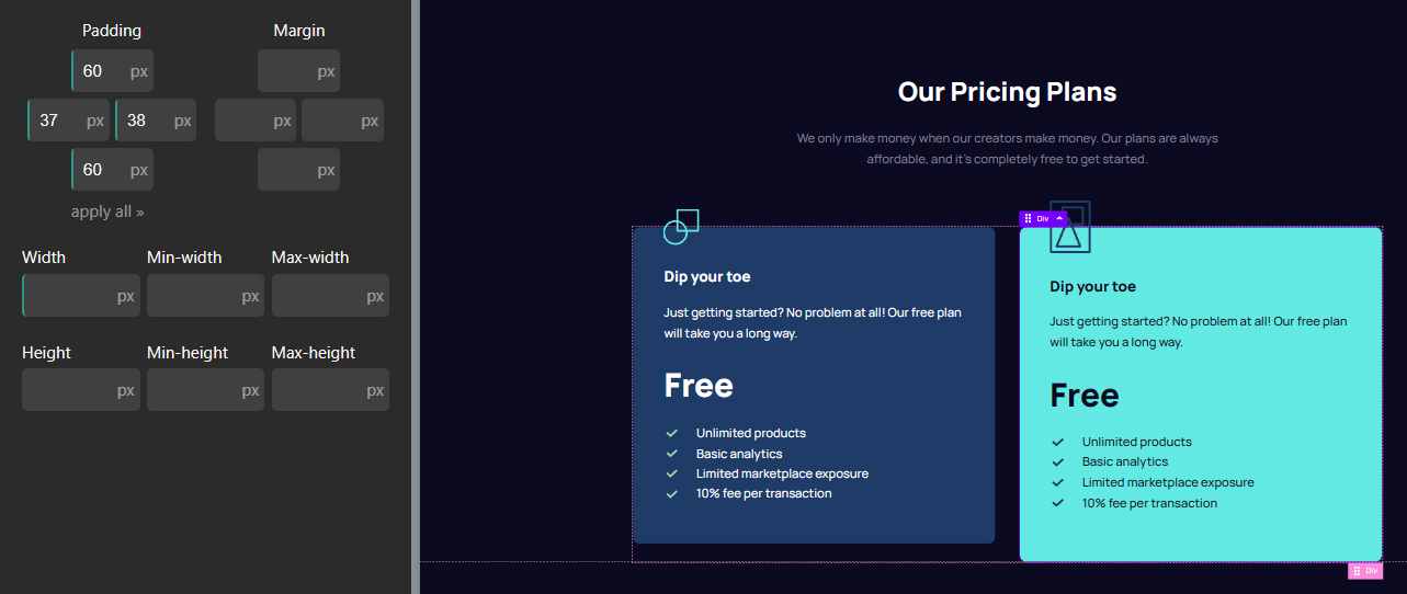
And then, set the horizontal-alignment like so
Note that these properties are the equivalent of the following CSS code:
    .pricing-boxes {
        display: flex;
        align-items: center;
        flex-direction: column;
    }
Now, let's also get the actual copy in as well
And finally, let's get the "per-month" tag going there
The original Figma design has this cool "/per month" thing going like so:
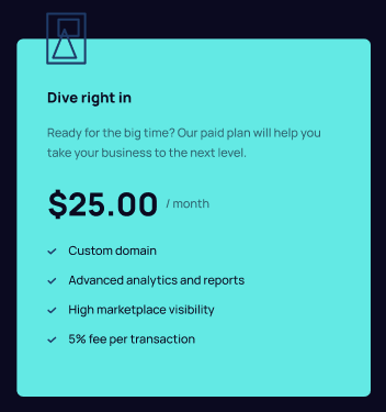
To replicate it, in HTML we could do this structure:
<div class="pricing-box-price-tag">
<p>$25.00</p> <p class="per-month-tag">/month</p>
</div>
We have a wrapping div that we can use to control things, and the price and tag are separate paragraph elements. I'll go ahead and replicate the same in Oxygen like so:
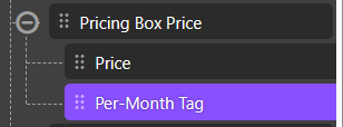
To get this:

We'll first want to set the price div to display: flex with a flex-direction: row. I just want to reiterate that there are two ways to set flex properties in Oxygen, and they are equivalent.
A) You can click "Horizontal" in the primary panel
This is the implicit approach where simply clicking this button selects the correct flexbox properties behind the scenes. Simply clicking the "Horizontal" button is equivalent to writing the following CSS:
    .pricing-box-price-tag {
        display: flex;
        align-items: center;
    }
B) You can set it from the advanced > layout panel
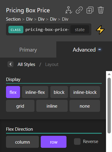
This is the explicit approach. You're setting the same thing if you do it from the "Advanced" panel. It's just that the primary panel is designed to save you on clicks and use more "Friendly terminology", such as saying "Horizontal" instead of saying "Flex direction of row".
And with that, we're getting just a tad bit closer

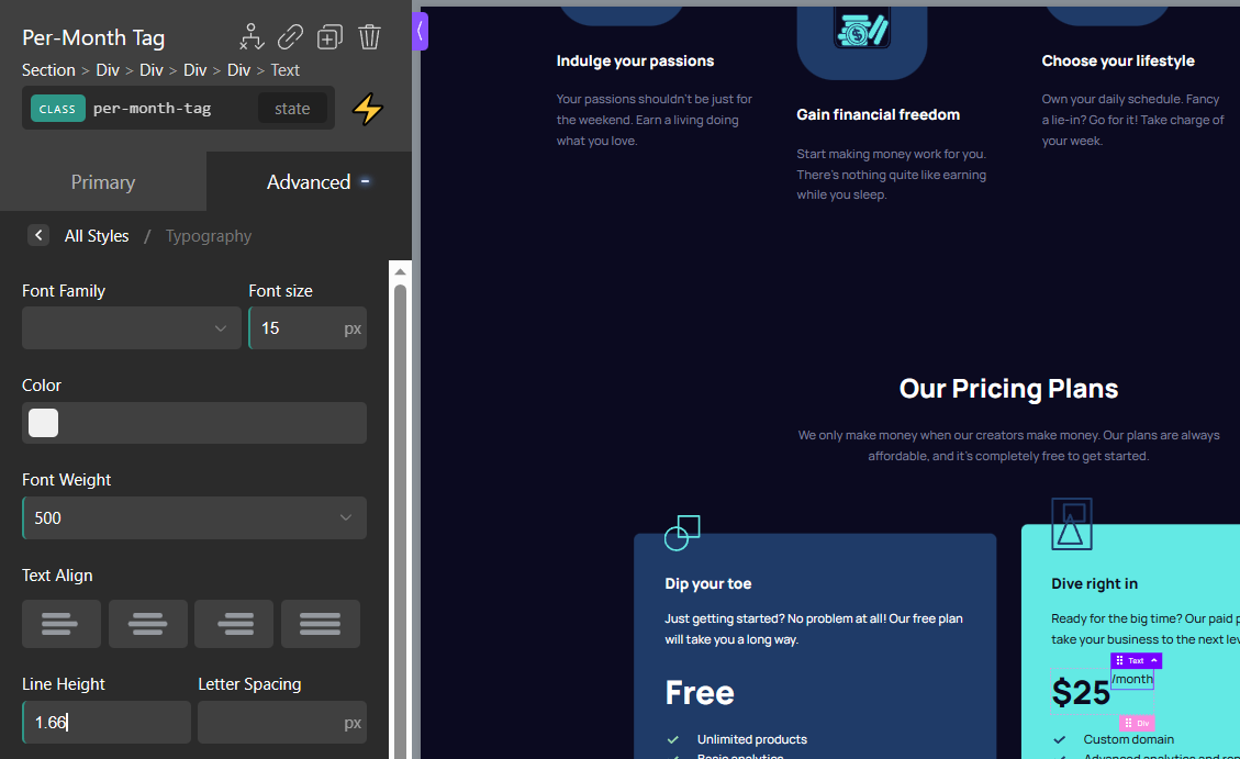
We can now set the tag to match the Figma values like so:
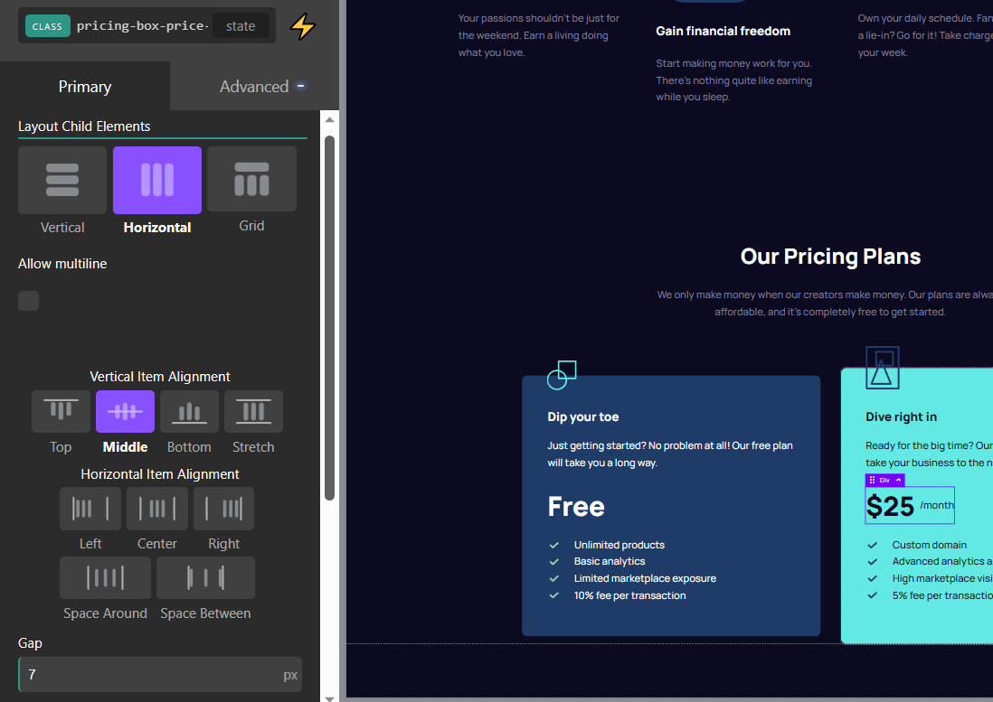
And the only thing left to do is to center it. Just go back to the pricing element, click on "Middle", and set a gap of 7px to create space
One final tweak in pricing to match Figma exactly
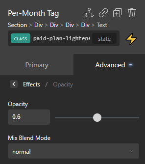
The Figma file has a lowered opacity for the .per-month-tag as well as the text description in the paid plan.
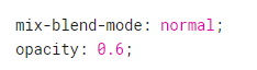
Applying this in Oxygen is done from the Effects > Opacity panel
And finally, let's add that header
I won't be documenting this part as it's quite simple and you should know exactly how to do it by this point. If we add the Header (matching Figma) we have our design finalized
Bonus: Converting the typography to utilize REMs
One of the best tricks I've ever learned with CSS is how Josh Comeau deals with converting pixel values into REMs. It involves defining your pixel-to-rem conversions as CSS custom properties ("CSS variables").
For example, we can put this set of conversions in our stylesheet
html {

    /* Rem sizes as pixel-like css-variables*/
    /* These include all the Typography values in the Figma */

    --15px: 0.9375rem;
    --18px: 1.125rem;
    --24px: 1.5rem;
    --25px: 1.563rem;
    --32px: 2rem;
    --33px: 2.063rem;
    --40px: 2.5rem;
    --44px: 2.75rem;
    --48px: 3rem;
    --55px: 3.438rem;
    --56px: 3.5rem;
}
This is very convenient if you're tasked with doing "pixel-perfect" conversions from Figma files. You can just go into the Figma file, and note all the values used for typography. Then simply assign them to the REM equivalents like above.
You can then substitute any px-defined values:
/* going from this */

.some-selector {
    font-size: 15px;
}

/* to this */

.some-selector {
    font-size: var(--15px);
}
Using CSS variables in Oxygen Builder is pretty easy. You can use them anywhere you want. All you have to do is select the "none" unit type and then type in your variable.
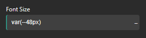
So if we want to convert the Hero heading to use these we need to choose "none" from the unit dropdown menu like so:
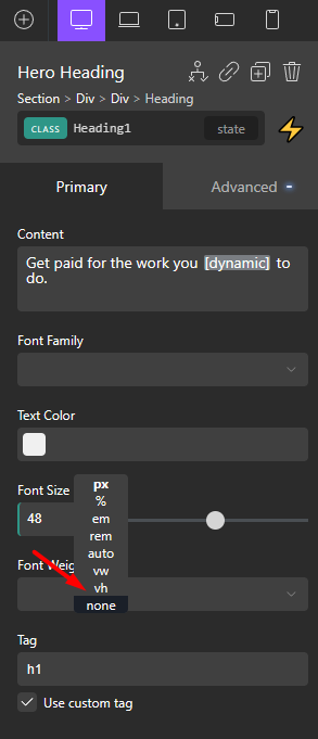
Once we do that the field will expand and we can type in the CSS variable like so:
And yes, this works in global settings panels as well
With this trick, you can now convert all typography to use Rems, but the design will remain identical, and match the Figma perfectly.
Just to be clear. You're not required to use this method
You can set rem values in Oxygen directly. I just find it more convenient if the values in the panels say something like --15px rather than 0.9375rem. It's a lot less mental overhead when I'm trying to recreate a given Figma design in a "pixel-perfect" way.


